Internal Document — Not for Public Distribution
Digital Scientists
Brand & Site Guide
The single source of truth for anyone — internal team or agency — working on the DS brand, website, or marketing materials.
Part 1 — Brand Identity
1. Who We Are
Digital Scientists builds and operates modern healthcare platforms. Founded in 2007 in Atlanta, Georgia (21 S Main St, Alpharetta, GA 30009), we are an innovation partner that applies the scientific method to software product development.
We help organizations discover what's worth building, prove it works, and scale it to production. We partner with healthcare organizations to fix operational problems, support clinical teams, and deliver measurable financial and quality outcomes using custom digital and AI solutions.
We are not a dev shop. We are not a consultancy. We are not a platform vendor. We are scientists — disciplined, evidence-driven, and unafraid of complexity. We work alongside our clients as partners, not vendors.
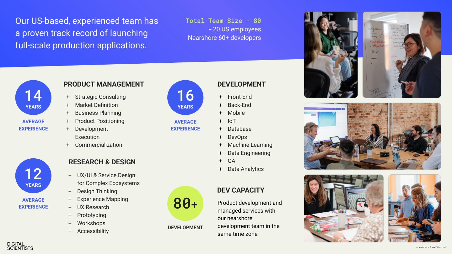
By the Numbers
80+
Total team. ~20 US, 60+ nearshore same-timezone.
12–16 yrs
Avg experience across PM, Design, Development.
100%
Production rate on healthcare AI projects.
$20M+
Verified client ROI across portfolio.
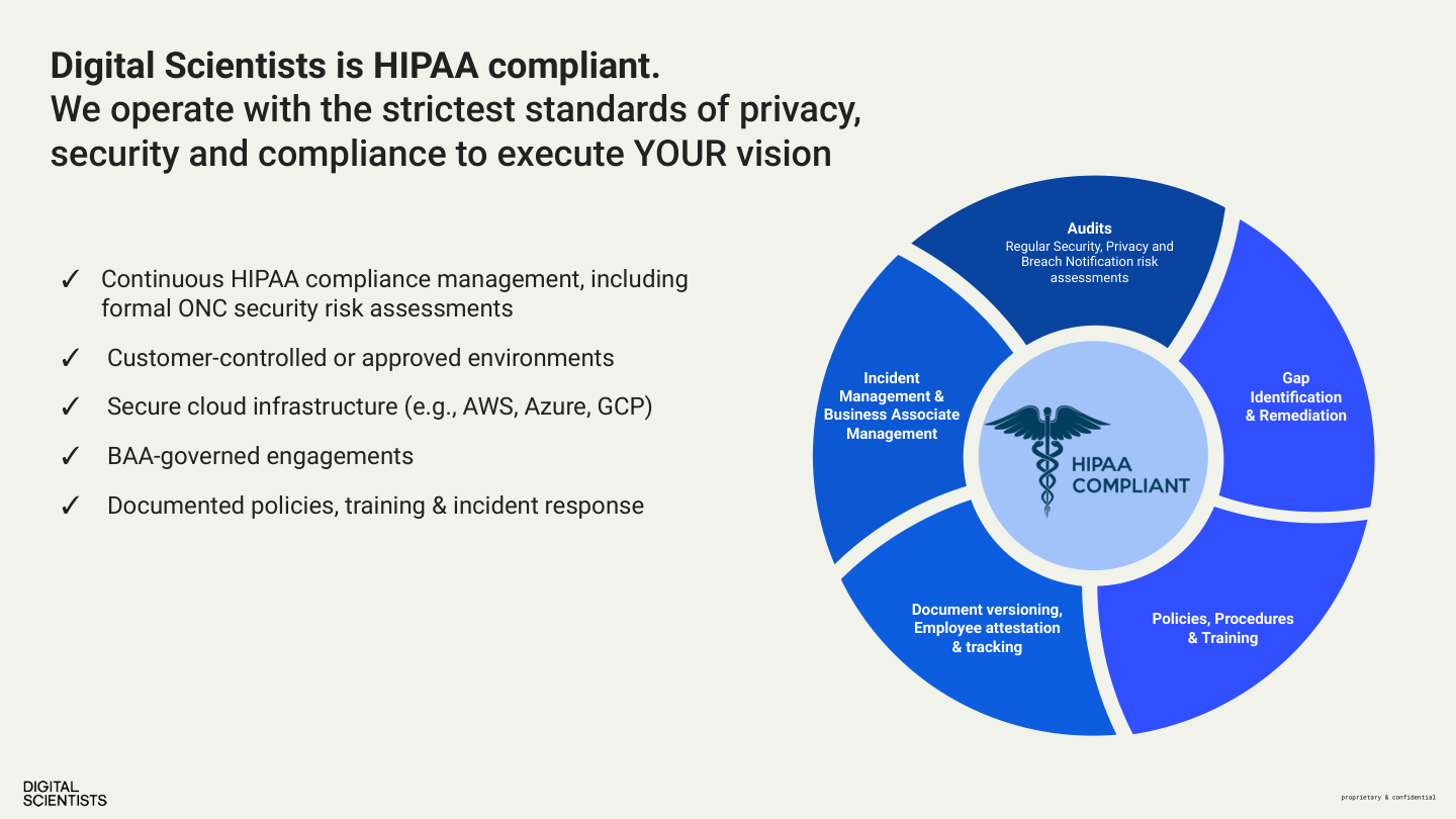
HIPAA Compliance
Digital Scientists is HIPAA compliant. We operate with the strictest standards of privacy, security, and compliance:
- ✓ Continuous HIPAA compliance management, including formal ONC security risk assessments
- ✓ Customer-controlled or approved environments (AWS, Azure, GCP)
- ✓ BAA-governed engagements
- ✓ Documented policies, training, and incident response
- ✓ Regular security, privacy, and breach notification risk assessments
Service Pillars
Product Management
Strategic consulting, market definition, business planning, product positioning, development execution, commercialization.
Research & Design
UX/UI and service design for complex ecosystems, design thinking, experience mapping, UX research, prototyping, workshops, accessibility.
Development
Front-end, back-end, mobile, IoT, database, DevOps, machine learning, data engineering, QA, data analytics.
Part 1 — Brand Identity
2. Brand Evolution
The DS brand has evolved significantly since the original 2019 guidelines (a 61-page agency-produced PDF). This guide supersedes that document entirely.
Canonical Sources (in priority order)
- digitalscientists.com — The live site is the most current asset for language, positioning, targeting, tone, and voice.
- This brand guide (bobklein.github.io/ds-brand-guide) — The authoritative reference for visual identity, design system, and channel standards.
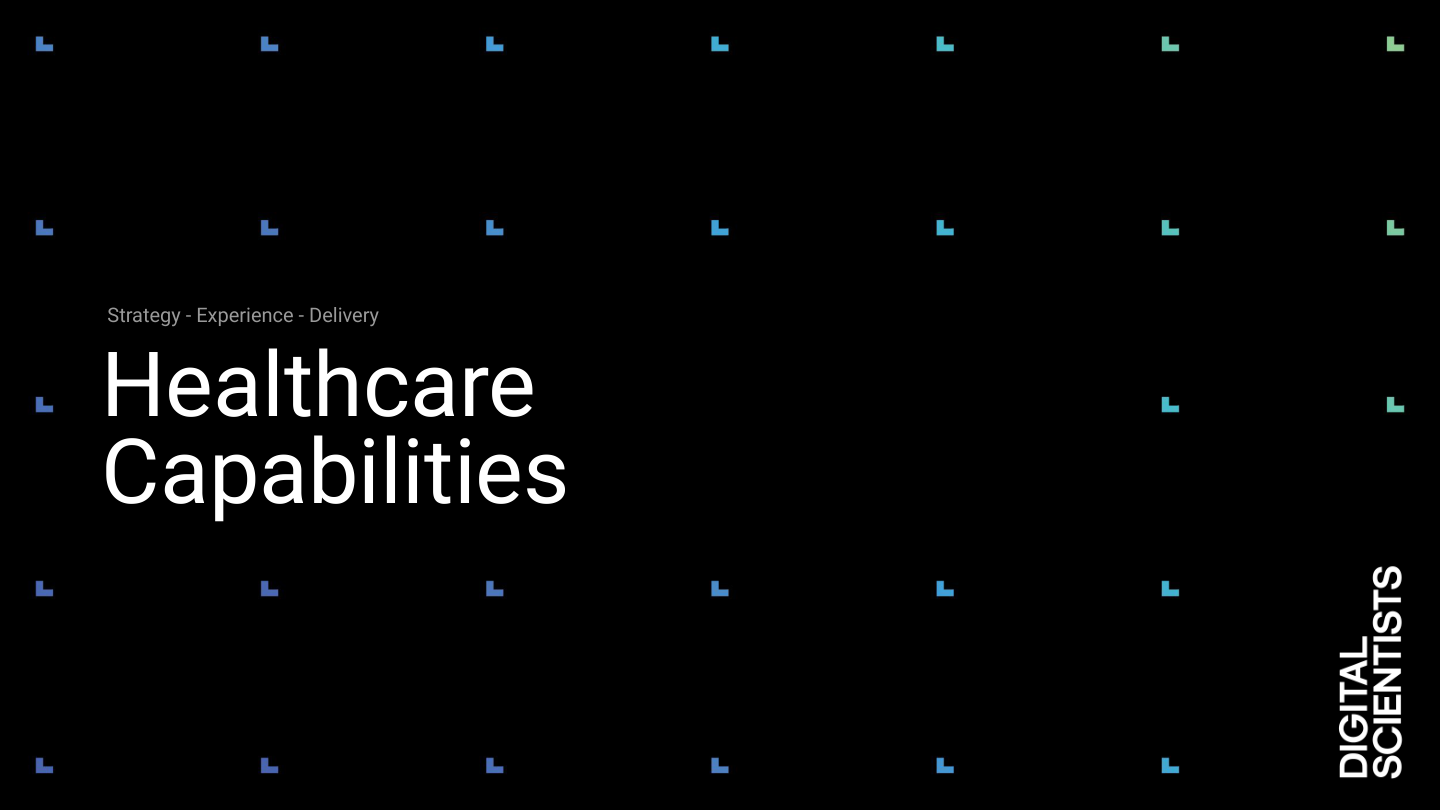
- Healthcare Capabilities 2026 deck — The most current sales presentation. See §26 Presentations for slides.
Superseded / Do Not Use
- • 2019 Brand Guidelines PDF (1014DS_Guidelines) — Outdated positioning, retired font (RM Pro), retired tagline (“experience lab”)
- • 2023 Sales Deck Templates (Product Blueprint, GV Design Sprint, Advisory Services) — Pre-healthcare-pivot, general positioning
2007 — Founded
Digital Scientists founded in Atlanta. Companies need a partner who helps them figure out what to build — and then builds it.
2019 — "Experience Lab" Era
Brand guidelines published. Positioned as "an experience lab that accelerates innovation for growth." Primary palette: black & white with spectrum accents. Font: RM Pro. Methodology: Direct, Discover, Design, Develop, Deploy.
2024–2025 — Repositioning Begins
Healthcare emerges as the primary vertical. AI becomes the horizontal capability. Site migration from WordPress to static HTML. New design system: Inter font, dsBlue-led palette, Tailwind CSS.
2026 — Current State
"Builds and operates modern healthcare platforms." Methodology: Discover, Experiment, Engineer, Optimize. Healthcare-first positioning with AI woven throughout. This guide is the authoritative reference.
What Changed
| Element | 2019 | 2026 |
|---|---|---|
| Positioning | "Experience innovation lab" | "Builds and operates modern healthcare platforms" |
| Primary font | RM Pro | Inter |
| Primary color | Black & white | DS Blue #304FFF |
| Methodology | Direct / Discover / Design / Develop / Deploy | Discover / Experiment / Engineer / Optimize |
| Vertical focus | Cross-industry | Healthcare-first |
| Site platform | WordPress | Static HTML / Netlify |
Part 1 — Brand Identity
3. The Name
We lean into the name. "Digital Scientists" is not a metaphor — it's a method.
Rigor Over Hype
We test hypotheses. We gather evidence. We make decisions based on data, not assumptions.
Curiosity
We are drawn to the hard problems. Complex regulatory environments, massive data sets, legacy systems that everyone else avoids.
Honesty
If the evidence says stop, we stop. That is not failure — that is the methodology working.
Usage Rules
- Use the full name "Digital Scientists" in formal contexts (press, proposals, contracts).
- "DS" is acceptable in internal shorthand and casual communication.
- Never abbreviate to "DigiSci," "DigSci," or similar.
- Never refer to the company as "Digital Scientist" (singular).
Part 1 — Brand Identity
4. Core Values
Carried forward from 2019. These still define who we are.
The foundation of our practice. We are constantly learning, always discovering how to push boundaries. An openness to asking "what if?" drives everything we build.
We don't know everything. We listen first. Sometimes a failed experiment is our best teacher. We believe openness to listening is critical to growth.
Fidelity to our process and methodology matters. We practice what we preach, constantly seeking improvement to our way of doing things. Evidence earns the next investment.
We commit. We desire more than just a contract — we earn lasting partnerships. We don't just build and hand off. We operate, support, and stand behind our work.
Part 1 — Brand Identity
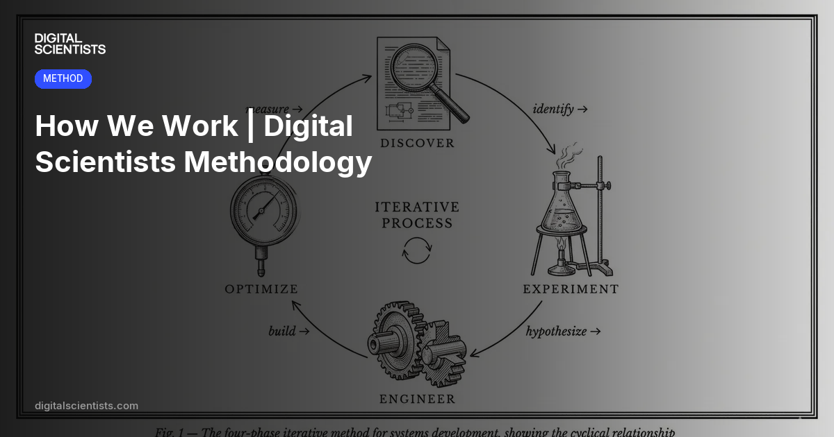
5. Methodology
Our four-phase framework is the intellectual backbone of how we work and how we talk about our work.
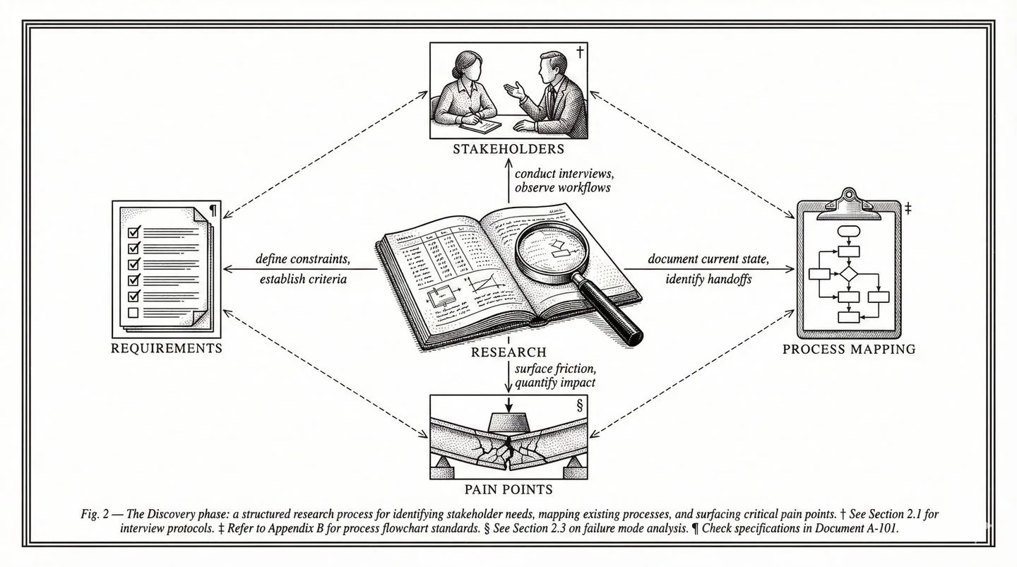
Discover
"What should we do?"
Research, opportunity mapping, prioritization. We identify the highest-ROI problem to solve.
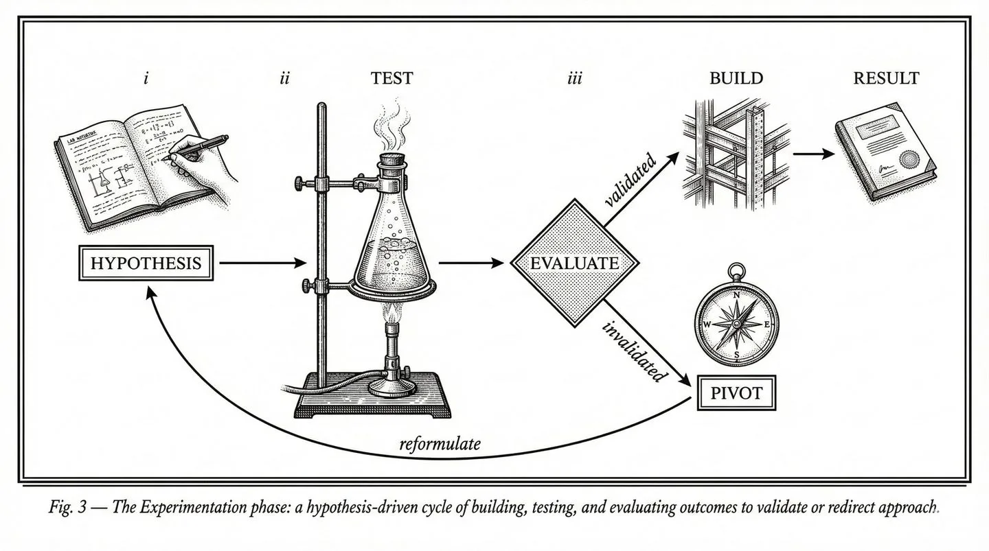
Experiment
"Does it actually work?"
Working prototypes and MVPs tested on real data, real workflows, real users. Proof before commitment.
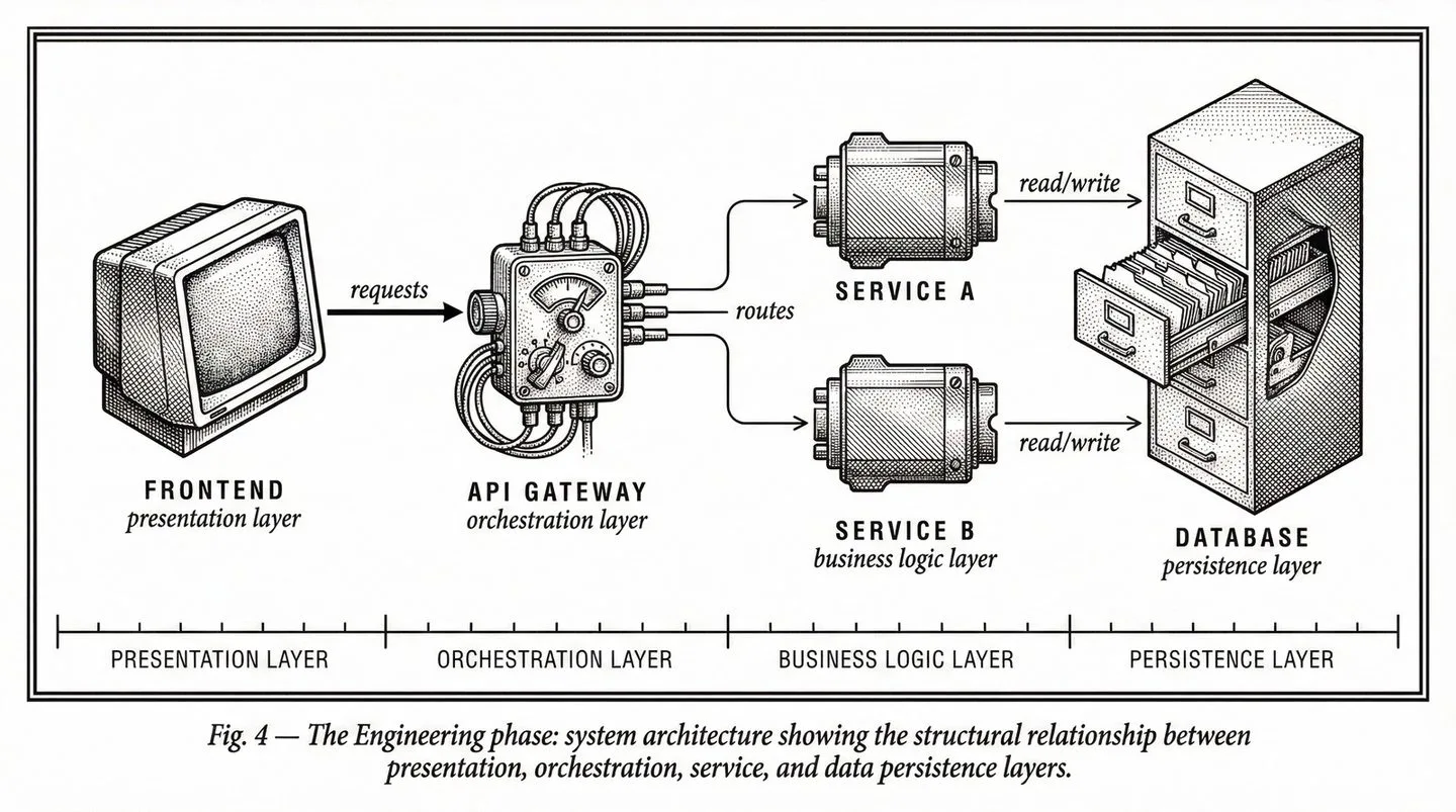
Engineer
"Make it real."
Sprint-based production engineering. Architecture for scale, security, and integration.
Optimize
"Make it better."
Ongoing support, monitoring, continuous improvement until KPIs are hit and beyond.
Framework Visual
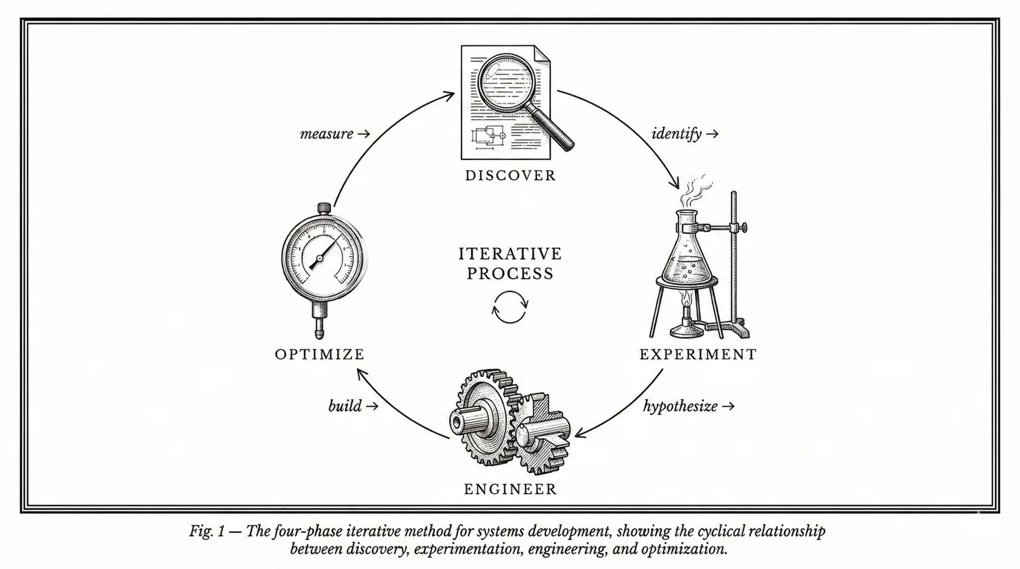
The METHOD framework as it appears on the website — four phases with evidence gates between each stage.
Discover
Experiment
Engineer
Optimize
The Principle
Evidence earns the next investment. Every phase produces proof — a validated hypothesis, working software, measurable outcomes — that justifies moving forward.
Retired Framework
Never use the legacy "Direct, Discover, Design, Develop, Deploy" framework from the 2019 guidelines. That is retired. The canonical phrasing is Discover. Experiment. Engineer. Optimize.
Part 1 — Brand Identity
6. Voice & Tone
Confident, not corporate
We know what we are doing and we say so directly. We do not hedge with "we strive to" or "we aim to." We say "we do."
Evidence-first, not aspirational
We lead with proof — numbers, outcomes, production systems. We do not promise futures; we show track records.
Direct, not salesy
Short sentences. No jargon walls. The reader should feel like they are talking to a senior engineer — not a marketing department.
Warm, not distant
We are partners, not vendors. We use "we" and speak to specific buyer concerns. We acknowledge complexity honestly.
Two Voices
DS content uses two distinct voices depending on the channel and author.
Bob Klein (Personal LinkedIn, Bylined Posts)
- Opinionated and direct — takes a position, doesn't hedge
- Story-driven — often starts with an anecdote or observation
- First person: "I've seen this pattern repeatedly..."
- Willing to be contrarian: "Most healthcare apps fail HIPAA not out of ignorance but because..."
- Still professional — never snarky or dismissive
DS Company (Company LinkedIn, Website, Collateral)
- Expert and generous — shares how things work, not just that they work
- Third or second person: "Digital Scientists built..." or "Your organization can..."
- Data-backed: leads with metrics and outcomes
- Structured: uses frameworks and clear comparisons
- Authoritative without being preachy
Writing Rules
Active voice
"We reduced documentation time from 45 minutes to 5 minutes" — not "Documentation time was reduced."
Specific over vague
"$10M+ in PDPM revenue recovered" — not "significant cost savings."
Lead with the result
"50X faster medical coding — here's how" — not "How we improved medical coding."
No buzzword soup
Never: "leveraging cutting-edge AI to transform healthcare delivery." Instead: "We built an AI coding platform that reviews patients 50X faster."
No urgency theater
No countdown timers, no false scarcity, no "act now before it's too late," no "limited spots."
Earn every claim
Every quantitative claim must be traceable to a real engagement. Never fabricate or round up metrics.
Terminology Preferences
| Use | Don't Use |
|---|---|
| custom software | bespoke solutions |
| AI-powered | AI-driven, AI-enabled, intelligent |
| healthcare software | health tech, healthtech, digital health |
| clinician burden | provider burnout (unless quoting) |
| lost revenue | revenue leakage (unless in context) |
| build | develop, engineer (in marketing copy) |
| engagement | project (we run engagements, not projects) |
Words We Use vs. Words We Don't
| Use This | Not This |
|---|---|
| evidence | best practices |
| proof | thought leadership |
| build | leverage (as a verb) |
| operate | ensure |
| verify, confirm | ensure |
| production | at scale |
| specific numbers ("130+ facilities") | industry-leading |
| partner | vendor, provider |
| complex, challenging | robust, comprehensive |
| work, use | leverage, utilize |
| do not | don't (in formal/security contexts) |
Banned Words
These words are banned from all new content. Replace them in existing pages when encountered.
Tone by Context
| Context | Tone | Example |
|---|---|---|
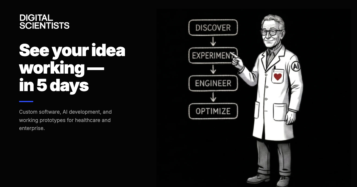
| Homepage | Confident, inviting | "See your idea working — in 5 days" |
| Healthcare pages | Authoritative, specific | "AI-powered clinical documentation that integrates with your EHR" |
| Case studies | Results-oriented, factual | "30% reduction in task completion time across 72 facilities" |
| Blog posts | Thoughtful, educational | Teaching the reader something useful, not selling |
| Security/compliance | Formal, precise | "We do not store PHI in test environments" |
| CTAs | Direct, low-pressure | "30-minute call. No pitch. Just honest assessment." |
Voice in Action
Rules are easy to nod at and hard to follow. This section shows what the DS voice actually sounds like — with real copy from the live site and before/after rewrites that any agency or AI tool should study before producing content.
Canonical Voice Pages (use these as reference)
- • digitalscientists.com — Homepage hero, methodology, industry sections
- • digitalscientists.com/healthcare — The gold standard for healthcare positioning
- • digitalscientists.com/method — Methodology pages (Discover, Experiment, Engineer, Optimize)
Other pages may contain legacy language from the pre-2025 site. Do not use older pages as voice references.
Before & After: Agency Draft → DS Voice
These show the transformation from generic/AI-generated copy to the actual DS voice. Study the pattern.
✗ Generic / AI Slop
“Digital Scientists is a leading healthcare technology company providing innovative, cutting-edge AI solutions that transform clinical workflows and drive operational excellence.”
✓ DS Voice
“Healthcare software that reduces clinician burden and recovers lost revenue.”
One sentence. One claim. No adjectives doing the work — the specificity does.
✗ Generic / AI Slop
“Our team of dedicated professionals leverages state-of-the-art artificial intelligence to help healthcare organizations optimize their revenue cycle management processes.”
✓ DS Voice
“We built an AI coding engine that reviews patients 50X faster than manual MDS review. $10M+ in PDPM revenue recovered.”
Replace “leverages state-of-the-art AI” with what the AI actually does + the result.
✗ Generic / AI Slop
“In today's rapidly evolving healthcare landscape, organizations need a trusted technology partner to navigate complex digital transformation journeys.”
✓ DS Voice
“Documentation backlogs, denied claims, and disconnected systems cost health systems millions and burn out the people doing the work. These aren't technology problems — they're healthcare operations problems.”
Name the pain. Be specific. Skip the “landscape” framing entirely.
✗ Generic / AI Slop
“We are committed to delivering comprehensive, end-to-end solutions that empower healthcare providers to achieve better patient outcomes.”
✓ DS Voice
“Enterprise firms advise. We ship. And we stay.”
Short. Contrasting. Makes a claim about behavior, not intent.
✗ Generic / AI Slop
“Ready to unlock the full potential of AI in your healthcare organization? Contact our team of experts today to schedule a consultation and start your digital transformation.”
✓ DS Voice
“See your idea working — in 5 days. $20K. Working prototype. 100% IP ownership.”
Specific offer. Specific price. Specific timeline. Zero “unlock potential.”
✗ Generic / AI Slop
“Our robust platform seamlessly integrates with your existing systems to ensure a smooth transition and maximize ROI across your enterprise.”
✓ DS Voice
“The problem wasn't competence — it was capacity. Coordinators didn't have time to review every clinical note for every resident. Revenue was walking out the door.”
Tell the story from the user’s perspective. Name the real constraint.
Annotated Examples from the Live Site
Real copy from current canonical pages, with annotations showing why it works.
Homepage — Hero
“See your idea working — in 5 days”
Homepage — AI Explanation Cards
“I don’t have to hire three more people.”
“I finally know what's going on.”
“That was supposed to take six months.”
Healthcare — Hero
“Healthcare software that reduces clinician burden and recovers lost revenue.”
Healthcare — Challenge Section
“95% of healthcare AI never reaches production.”
Homepage — Partnership Section
“Enterprise firms advise. We ship. And we stay.”
AI Slop Detector
Run every piece of content through this checklist before publishing. If any item triggers, rewrite that section.
Opening Line Red Flags
- ✗ “In today’s rapidly evolving...”
- ✗ “In an era of...”
- ✗ “As healthcare continues to...”
- ✗ “It’s no secret that...”
- ✗ “The healthcare industry is undergoing...”
- ✗ Any sentence that could open a competitor’s page
Filler & Padding Patterns
- ✗ “Our team of dedicated professionals...”
- ✗ “...to help you achieve your goals”
- ✗ “We are committed to...”
- ✗ “...empowering organizations to...”
- ✗ “...unlock the full potential of...”
- ✗ Sentences with 3+ adjectives before the noun
Structure Red Flags
- ✗ No numbers in the first 3 sentences
- ✗ Claims without evidence (“best-in-class”)
- ✗ Passive voice (“outcomes were improved”)
- ✗ CTA that says “contact us today” without a specific offer
- ✗ More than 2 sentences before getting to the point
DS Voice Quick Test
- ✓ Could a competitor say this? If yes → rewrite
- ✓ Is there a number in the first 2 sentences?
- ✓ Does the CTA have a specific action + timeframe?
- ✓ Would a CMO read this in <10 seconds and get it?
- ✓ Could you say this out loud without cringing?
Copy Templates
Reusable patterns for common content types. Fill in the brackets.
Headline Formula (Capability Pages)
[Specific outcome noun] that [verb for buyer pain] and [verb for buyer gain].
Example: “Healthcare software that reduces clinician burden and recovers lost revenue.”
Case Study Headline Formula
[Dollar/percent metric] [outcome verb past tense]. [Second metric or context.]
Example: “$10M PDPM revenue recovered. $2M in quality incentives.”
CTA Formula
[Action verb] [specific deliverable] — [constraint that lowers friction].
Example: “See your idea working — in 5 days.” / “30-minute call. No pitch. Just honest assessment.”
Contrast Statement Formula
[Competitors/industry] [what they do]. We [what we do differently]. [And the part that matters.]
Example: “Enterprise firms advise. We ship. And we stay.”
LinkedIn Ad / Short-Form Formula
[Stat or contrarian claim]. [One-line context]. [CTA with specific offer.]
Example: “95% of healthcare AI never reaches production. Ours does. See how — in 5 days.”
LinkedIn campaign examples will be added here as they go live.
Part 1 — Brand Identity
7. GTM Positioning & Messaging
Healthcare (Vertical) × AI (Horizontal)
DS is a healthcare technology partner that applies AI across healthcare domains — not an AI company that happens to do healthcare, and not a healthcare company that dabbles in AI.
Healthcare earns credibility
Our depth in healthcare proves we can operate in complex, regulated environments. This credibility transfers to other verticals.
AI earns attention
AI is what buyers search for now. Our AI positioning brings people to the site; healthcare proof points close the deal.
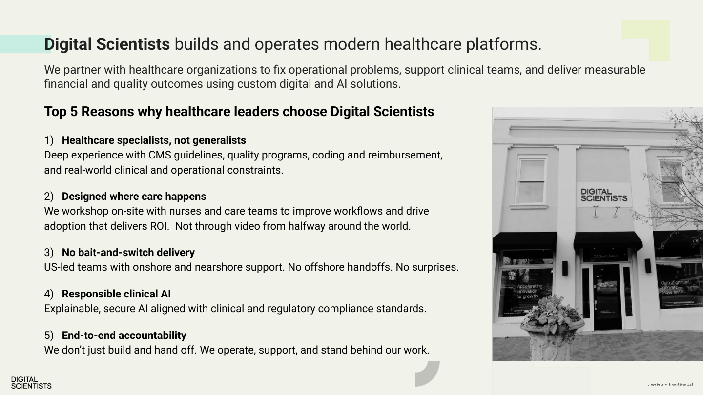
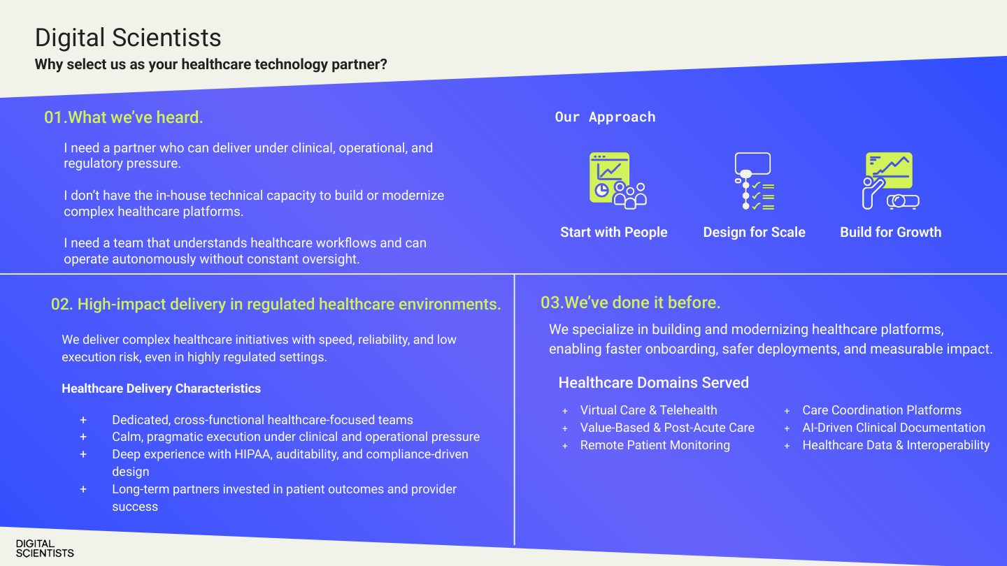
Top 5 Reasons Healthcare Leaders Choose DS
Healthcare specialists, not generalists
Deep experience with CMS guidelines, quality programs, coding and reimbursement, and real-world clinical/operational constraints.
Designed where care happens
We workshop on-site with nurses and care teams. Not through video from halfway around the world.
No bait-and-switch delivery
US-led teams with nearshore support. No offshore handoffs. No surprises.
Responsible clinical AI
Explainable, secure AI aligned with clinical and regulatory compliance standards.
End-to-end accountability
We don't just build and hand off. We operate, support, and stand behind our work.
Healthcare Domains Served
Virtual Care & Telehealth
Value-Based & Post-Acute Care
Remote Patient Monitoring
Care Coordination Platforms
AI-Driven Clinical Documentation
Healthcare Data & Interoperability
Anti-Positioning
Not a consultancy
We deliver working software, not strategy decks.
Not an EHR implementor
We build AI that makes your existing EHR smarter.
Not a platform vendor
We build systems you own, not subscriptions.
Not a dev shop
We own the value chain from messy data to outcomes.
Reference Proof Points
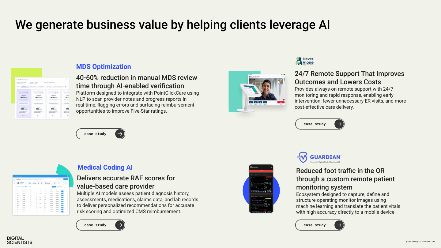
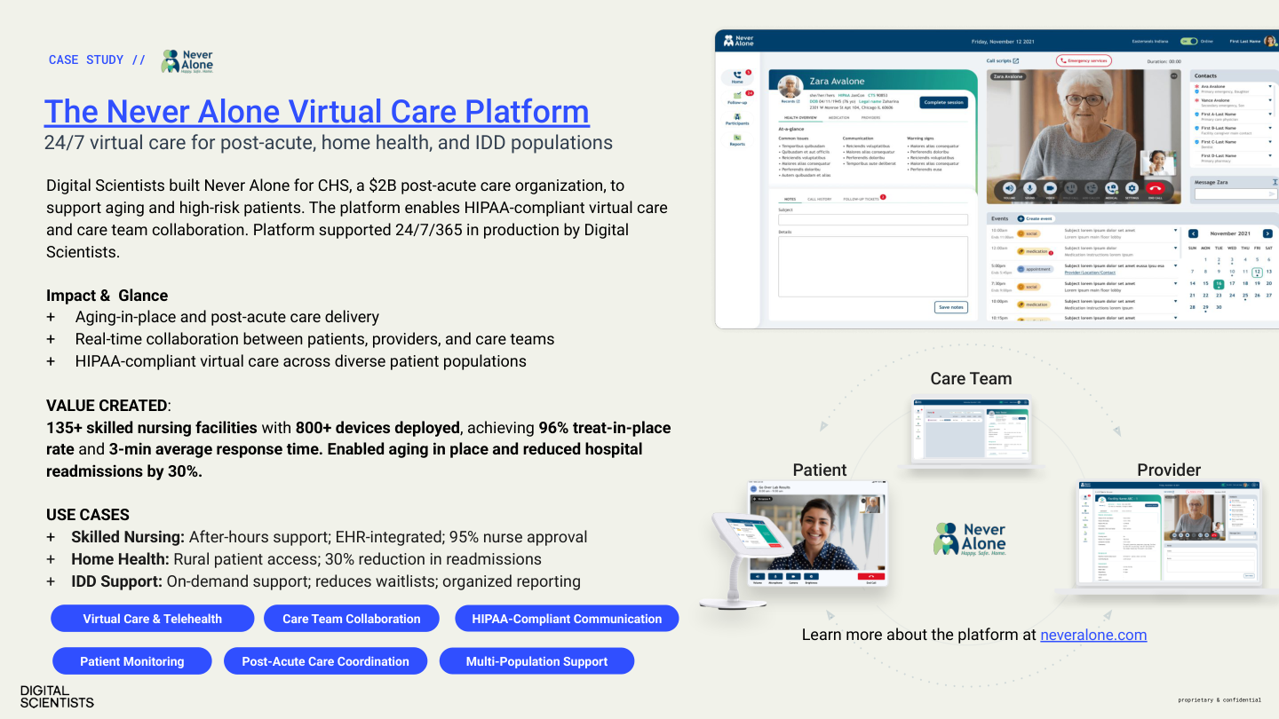
Never Alone
135+ SNFs, 800+ devices, 96% treat-in-place, 3-min response time. 30% reduction in hospital readmissions.
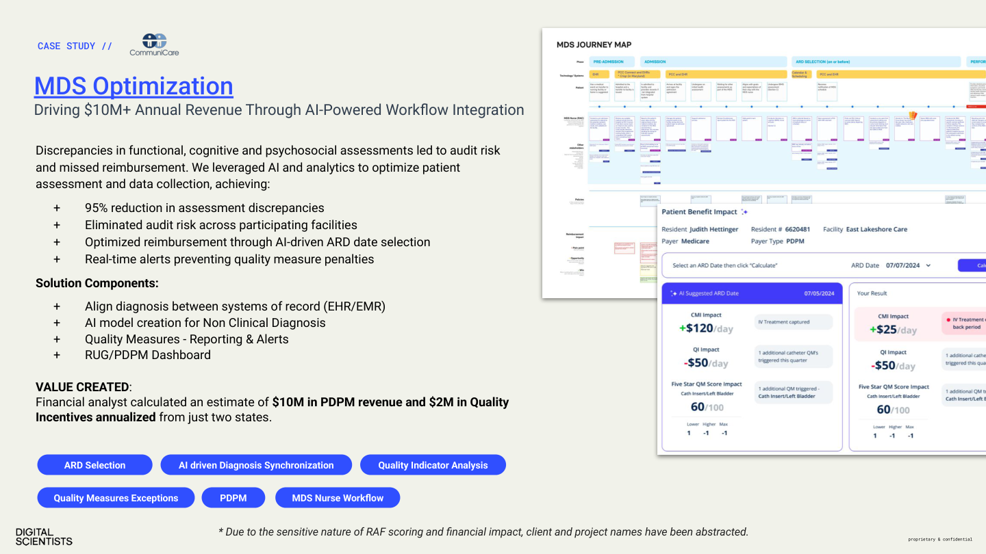
MDS Optimization
$10M PDPM revenue, $2M quality incentives, 95% reduction in assessment discrepancies.
RAF Score / Medical Coding AI
$2.4M+ annual revenue, 12-week build, 98% clinician adoption, 20,000+ patients.
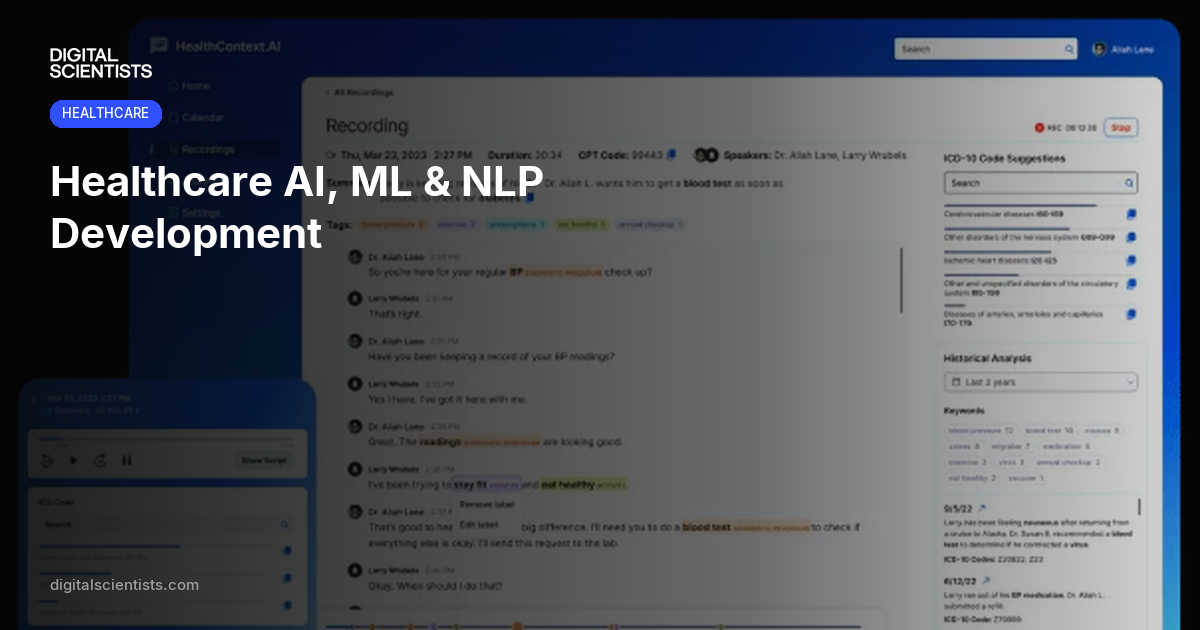
HealthContext.AI
100K+ AI-documented encounters, 6,000+ monthly calls, 90-day MVP, 700+ devices in 7 states.
Key Phrases to Own
Recommended Boilerplate
Short (1 sentence): Digital Scientists builds custom AI and software for healthcare operators, with $20M+ in verified financial impact and a 100% production rate.
Medium (2-3 sentences): Digital Scientists builds custom AI and software for healthcare. Specializing in post-acute care, revenue cycle, and clinical documentation, the firm has delivered $20M+ in verified financial impact with a 100% production rate. 80+ team members. Atlanta-based, serving healthcare operators nationwide.
Full: Digital Scientists is a healthcare technology partner that builds and operates modern healthcare platforms. Founded in 2007 in Atlanta, Georgia, the firm specializes in custom AI and software for post-acute care, revenue cycle management, and clinical documentation. With 80+ team members averaging 12-16 years of experience, DS has delivered $20M+ in verified client ROI — including $10M in recovered PDPM revenue and $2.4M+ in annual RAF coding improvements. The company operates NeverAlone, a 24/7 virtual care platform serving 135+ skilled nursing facilities across 7 states. Every healthcare AI project DS has delivered has reached production.
Value Propositions by Audience
| Audience | Lead With | Proof Points |
|---|---|---|
| Healthcare CIO/CTO | Technical depth, HIPAA, integration | NeverAlone, 100% production rate, BAA process |
| Healthcare COO/CFO | ROI, efficiency, revenue recovery | $20M+ ROI, 30% task reduction, RAF/HCC coding |
| Startup founder | Speed, methodology, AI capability | 5-day proof of concept, Discover→Optimize |
| Enterprise innovation | De-risking, evidence-first | Methodology, cross-vertical case studies |
| Agency/partner | Execution, reliability, healthcare | Portfolio, team seniority, production record |
Part 2 — Visual Identity
8. Logo
The Digital Scientists wordmark celebrates the identity through clear, defined kerning, strong weight and placement. Two formats: the inline wordmark (used in navigation and compact contexts) and the stacked wordmark (used for primary brand presentation).
Stacked Wordmark
Compact Wordmark
Horizontal-ratio variant (165×48) for navigation bars and compact contexts.
Circle Marks
Contained circular mark for favicons, app icons, and contexts requiring a round logo.
Social Avatars
Pre-cropped square avatars for Google, LinkedIn, GitHub, and other profile contexts.
Logo Rules
From the 2019 brand guidelines (pages 16–23). These rules apply to all wordmark variants.
Color Variants
Two color variations only — creating two possible brand color combinations. When deciding which to use, consider contrast first and foremost. The logo needs to stand strong on whatever color or background it is used against.
Clear Space
Allow at least 0.375in surrounding all sides. No competing elements such as text or shapes should interfere with this negative space. More white space is generally a good thing.
Minimum Sizes
Print: 0.69in wide minimum. Digital: 50px wide minimum. Below these sizes the wordmark becomes too small to read.
Pairing
When paired with a secondary logo, spacing and sizing are important — maintain a visual, equal balance between all logos. Simplicity is a good thing.
Over Photography
When used over any photography, image, pattern, or color, make sure there is clear space for it to reside. The logo cannot stand against busy backgrounds — select an image that allows space for it to stand out. Color contrast is also important.
Scaling
Always scale proportionately. Never skew or stretch the wordmark.
Improper Usage
Don't let the Digital Scientists logo fall victim to inconsistent handling. Always maintain proper guideline standards.
Available logo files
| File | Format | Use Case |
|---|---|---|
| logo-black.svg / logo-white.svg | SVG | Stacked wordmark — primary brand mark (360×360) |
| ds-logo-black.svg / ds-logo-white.svg | SVG | Compact wordmark — navigation, horizontal-ratio use (165×48) |
| logo-native-black.png / white.png | PNG | Raster wordmark for contexts that don't support SVG |
| logo-*-circle.svg / .png | SVG, PNG | Circle-contained mark for social avatars, favicons |
| avatar-01.png / avatar-02.png | PNG | Square avatars — black/white wordmark for profiles |
| avatar-google.jpg | JPG | Branded gradient avatar for Google profile |
| shapes-01.svg / shapes-02.svg | SVG | Pixel extraction graphic elements (see Section 12) |
| 1012DS_Logo.ai / _Black.eps / _White.eps | AI, EPS | Source files for print production (in Google Drive) |
Part 2 — Visual Identity
9. Colors
Brand Palette
Click any swatch to copy its hex value. The spectrum (blue → teal → lime) is preserved from the 2019 guidelines. The evolution: from B&W primary to blue-led.
DS Blue
#304FFF
RGB 48, 79, 254
CMYK 81, 69, 0, 0
Primary. Buttons, links, accents.
DS Black
#050505
RGB 5, 5, 5
Headlines, body, dark bgs.
DS Gray
#F5F5F5
RGB 245, 245, 245
Alternating section bgs.
DS Teal
#26D9C4
RGB 38, 217, 196
CMYK 62, 0, 34, 0
Checks, success, accents.
DS Lime
#D1F259
RGB 208, 242, 89
CMYK 22, 0, 80, 0
Highlights, badges. Sparingly.
Supporting Colors
#FFFFFF
#F9FAFB
#E5E7EB
#6B7280
#4B5563
#333333
Status Indicator Colors
Used in blog hero imagery, METHOD diagrams, presentations, and dashboards. Status indicators should be the brightest visual elements in any composition — they are accent, never fill.
Green
Validated, approved, complete
Amber
Under review, in progress, attention
Red
Gap found, risk, rejected
Gray
Not selected, pending, inactive
Color Pairing Rules
| Background | Text | Buttons | Links |
|---|---|---|---|
| White / dsGray | dsBlack headings, gray-600 body | bg-dsBlue text-white | text-dsBlue |
| dsBlack (#050505) | White headings, gray-500 body | bg-dsBlue text-white | text-white |
| #333333 (dark sections) | White headings, gray-300 body | bg-white text-dsBlack | text-white |
| dsBlue (#304FFF) | White text | bg-white text-dsBlue | text-white underline |
| dsTeal (#26D9C4) | dsBlack text | bg-dsBlack text-white | text-dsBlack underline |
| dsLime (#D1F259) | dsBlack text | bg-dsBlack text-white | text-dsBlack underline |
Colors in Imagery
LLM-Generated Illustrations
Muted corporate blues, soft slate grays, warm neutral backgrounds. Low saturation. Status indicators (R/A/G) are the most saturated elements. No bright fills, neon, or gradients.
Product Screenshots
Show as-is — no color-grading or filters. Container framing (rounded corners, shadow) provides visual separation.
Stock Photography
Muted, natural tones. No oversaturated, HDR-processed, or heavily filtered images. Healthcare: calm clinical settings. Technology: clean workspaces.
Part 2 — Visual Identity
10. Typography
Primary Typeface
Inter
Weights 300–800. All headings and body text.
Display (800, -0.02em)
Section Heading (700)
Body text (400, 18px, line-height 1.6)
Label (500, uppercase)
Note: RM Pro was the 2019 font. Inter replaced it for the current web presence.
Monospace
Roboto Mono
Weights 400–500. Code, technical labels, metadata.
Technical label (500)
Code inline (400)
font-family: 'Roboto Mono'
Roboto Mono is carried forward from the 2019 guidelines alongside RM Pro.
Download Fonts
Inter
Variable TTF + woff2 (weights 300–800)
Inter.zip (1.7 MB)Open source — SIL Open Font License
Roboto Mono
10 TTF files (Thin–Bold, Regular & Italic)
RobotoMono.zip (695 KB)Open source — Apache License 2.0
RM Pro
Desktop (OTF) + Web (woff/woff2), 8 weights
RMPro.zip (1.3 MB)Licensed — CoType EULA (see included PDF)
Rendered Samples
Inter — Weight Ramp
Light (300) — The evidence earns the next investment.
Regular (400) — The evidence earns the next investment.
Medium (500) — The evidence earns the next investment.
Semibold (600) — The evidence earns the next investment.
Bold (700) — The evidence earns the next investment.
Extrabold (800) — The evidence earns the next investment.
Heading with -0.02em tracking
We build software
that works harder.
letter-spacing: -0.02em
Roboto Mono — on dark
ABCDEFGHIJKLM
NOPQRSTUVWXYZ
abcdefghijklmnopqrstuvwxyz
0123456789 !@#$%&*
font-family: 'Roboto Mono', monospace
Type Scale
| Element | Size | Weight | Tracking | Line Height |
|---|---|---|---|---|
| h1 | 3.5rem (56px) | 800 | -0.02em | 1.1 |
| h2 | 2.5rem (40px) | 700 | -0.02em | 1.2 |
| h3 | 1.5rem (24px) | 600 | -0.02em | 1.3 |
| h4 | 1.25rem (20px) | 600 | -0.02em | 1.4 |
| Body | 1.125rem (18px) | 400 | normal | 1.6 |
| Label/pill | 0.75rem (12px) | 500 | 0.05em | 1.5 |
| Small/caption | 0.875rem (14px) | 400 | normal | 1.5 |
Part 2 — Visual Identity
11. The Scientist Character
The Scientist is a branded illustrated character that represents Digital Scientists visually. He appears on the homepage, in marketing materials, and across social media.
The character is new and will evolve. He was created using Nana Banana (an AI image generation tool). The visual style should remain consistent even as details are refined.
Visual Guidelines
- ✓ Professional but approachable — a scientist, not a cartoon
- ✓ Active contexts: working, pointing, explaining — never idle
- ✓ Reinforces the methodology framework
- ✓ DS brand color palette
- ✓ Always reference existing images for style consistency
Where He Appears
- Homepage hero (with methodology framework)
- Blog hero images (contextual element)
- Social media and marketing collateral
- OG/share images
Generating New Images
- Use Nana Banana for consistency
- Provide existing character images as reference
- Specify the scene/context
- Process output: resize to 1440px wide, convert to WebP, under 200KB
Light version — used on white/dsGray backgrounds (homepage hero)
Dark version — used for OG images, social media, dark-background contexts
Part 2 — Visual Identity
12. Graphic Elements
The 2019 brand guidelines introduced pixel extractions — geometric shapes derived from the DS brand that can form compositions, patterns, or standalone elements.
The current website does not use pixel extractions, but they remain available for marketing collateral, print materials, presentations, and social media graphics.


Pixel Extractions
- Geometric elements derived from the DS wordmark letterforms
- Can form compositions, patterns, or standalone accents
- Add a playful touch to the bold black-and-white palette
- Best used sparingly — should not overwhelm or clutter a composition
- Available as SVG files:
shapes-01.svg,shapes-02.svg
Pixel Extractions in Use
Business card front — dsBlack background with pixel grid pattern composed of extraction shapes.
Capabilities deck cover — pixel shapes used as background texture beneath the scientist character.
When to Use
Good for:
- Print collateral
- Presentation decks
- Social media graphics
- Event materials
Not currently used on:
- The production website
- Blog hero images
- Case study pages
Part 2 — Visual Identity
13. Office & Signage
Physical brand applications at 21 South Main Street, Alpharetta, GA 30009. Vendor: Signarama Roswell (795 Holcomb Bridge Road #D, Roswell, GA 30076 · 770-998-9126).
Current Window Banners (2024)

Banner 1 — “Leverage AI in Healthcare”
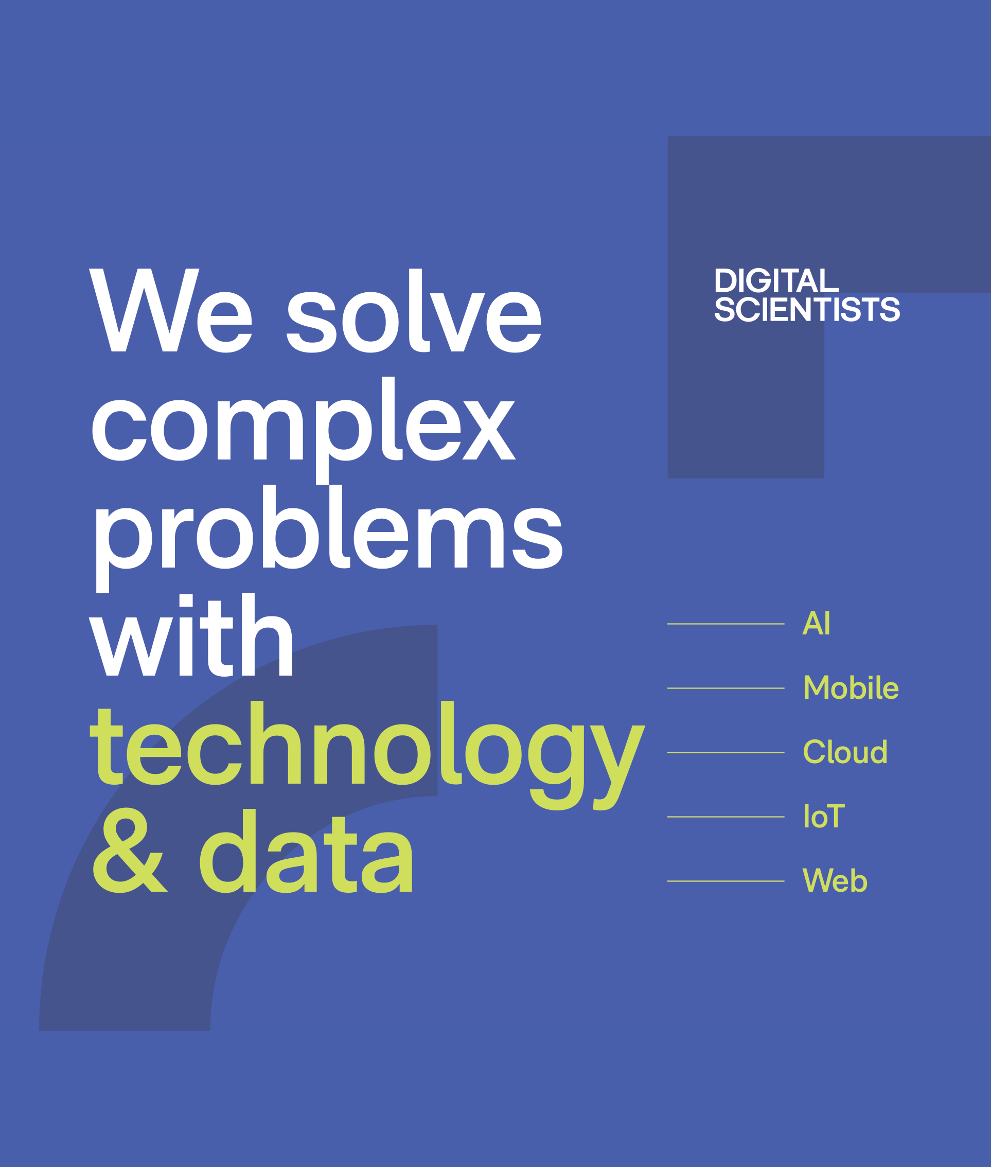
Banner 2 — “We solve complex problems with technology & data”
Exterior Frame Sign (2019)
Side frame — dsBlack with pixel extractions. (Messaging retired, artwork still installed)
Signage Specifications
Exterior Side Frame Banner
Updated January 2024
| Dimensions | 72″ × 108″ (6ft × 9ft portrait) |
| Visible area | 100.125″ × 64.125″ |
| Frame | BannerGrip™ front-load snap frame, anodized silver, screw-down security |
| Mount | Wall-mounted, outdoor rated |
| Background | Light / white |
| Headline | "We solve complex problems with technology & data" |
| Verticals shown | Healthcare · Logistics · Public Sector |
| Frame vendor | Alpina Mfg / FastChangeFrames.com (800-915-2828) |
| Source file | DigitalScientists-Ext-General-FINAL-RGB-012024.ai |
Front Window Banners (×2)
Updated January 2024
| Dimensions | 53.5″ × 63″ each |
| Mount | Hanging banners with pole pockets |
| Background | dsBlue (#304FFF) |
| Banner 1 | "Leverage AI in Healthcare" + HIPAA badge + QR code + phone |
| Banner 2 | "We solve complex problems with technology & data" + AI / Mobile / Cloud / IoT / Web |
| Source file | DigitalScientists-Window-FINAL-RGB-012024.ai |
Permanent Building Signage
Front Building Sign
| Material | 1/2″ PVC letters, individually painted |
| Mount | Black aluminum back plate (painted to match building) |
| Color | Black letters with matching returns |
| Lighting | Non-lighted |
Back Building Sign
| Dimensions | 84″w × 48″h |
| Material | 1/2″ raised PVC wall logo |
| Mount | Black polymetal back plate |
| Color | White letters with matching returns |
| Lighting | Non-lighted |
Neon Sign
| Dimensions | 54″w × 18″h |
| Material | Neon tubing |
| Mount | Black aluminum back plate |
| Color | White tubing, lit |
Vinyl Graphics
| Location | Dimensions | Material | Content |
|---|---|---|---|
| Front door — logo | 18″w × 5″h | Cut white vinyl | DS wordmark |
| Front door — contact | 18″w × 3″h | Cut white vinyl | Phone + website |
| Back doors | 12″w × 7.5″h | Cut white vinyl | Logo, phone, website |
| Side windows (×2) | 67″w × 60″h (window) | Cut vinyl | Dark gray + slate gray graphics |
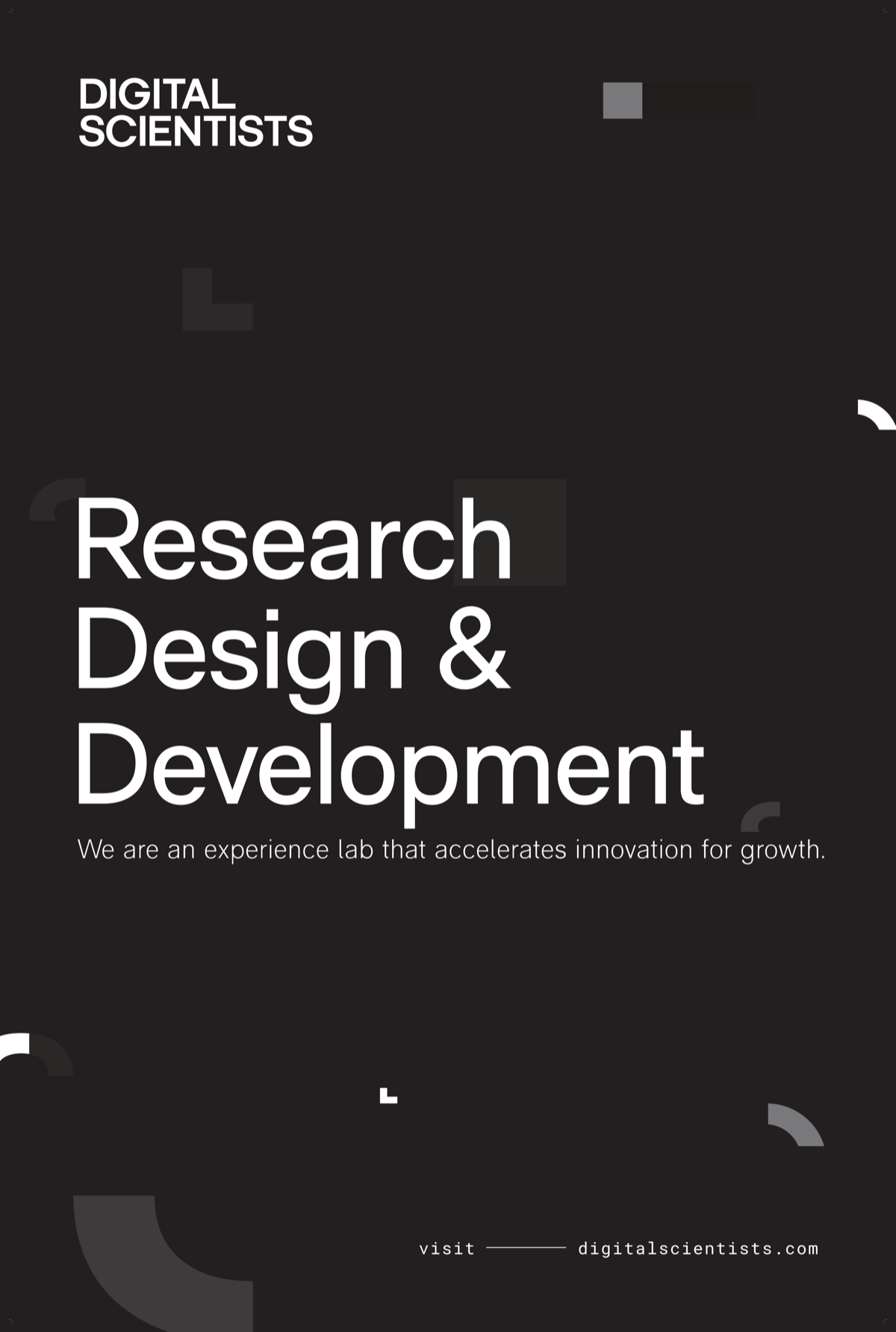
Retired Signage (2019) outdated — do not reproduce +
The 2019 exterior side frame (74″ × 110″) used "Research Design & Development" with the "experience lab" tagline on a dark background. This language is retired. The 2024 replacement reflects current positioning.
The 2019 exterior artwork (raised PVC wordmark, Roboto Mono phone/web, "21 South Main" address) is still physically installed and accurate — only the side frame messaging was replaced.
Source Files
All signage source files (Illustrator .ai, InDesign, PDFs in RGB and CMYK) are in the Google Drive under 105 Building/. 2024 finals are in the Finals/ subdirectory of each piece. Vendor quotes from Signarama are in _Assets/Quotes/.
Part 3 — Imagery & Content Creation
14. Imagery Standards
Every image on the site must earn its place. Images are not decoration — they are visual evidence.
Executive Tone
Calm, deliberate, structured, professional. If it feels flashy or dramatic — it fails.
One Image, One Job
A product we built, an argument we make, a capability we offer, or a result we delivered.
No Visual Slop
No glowing arrows, neon gradients, 3D effects, hexagons, floating icons, or "futuristic" anything.
Image Specifications
| Type | Width | Format | Max Size |
|---|---|---|---|
| Hero / banner | 1440px | PNG default; WebP for photos | 200KB |
| Section content | 1280px | PNG default; WebP for photos | 150KB |
| Blog inline | 960px | PNG default; WebP for photos | 100KB |
| Card thumbnail | 640px | PNG default; WebP for photos | 60KB |
| OG / social preview | 1200×630 | PNG (pngquant) | 300KB |
| Team headshot | 400px | WebP or JPEG (photo) | 40KB |
| Logo / icon | 200px | SVG preferred | 15KB |
Format Guidelines
PNG is the default format. Use for screenshots, UI mockups, diagrams, OG/social images, and anything with sharp edges, text, or flat color. Most site imagery falls into this category. Compress with pngquant (quality 80–95) to keep file sizes manageable without visible quality loss.
Use WebP for photographs and complex photographic content displayed on-page. Process with sips + cwebp at quality 82.
JPEG is acceptable only for photos — team photos, event photos, stock photography. Use when WebP is not practical (e.g., email templates, third-party platforms that don’t support WebP).
Use SVG for logos, icons, and simple vector graphics.
When in doubt, use PNG. If you receive a JPEG source file, convert it to PNG (for graphics) or WebP (for photos) before adding to the site.
Naming Convention
| Prefix | Use Case | Example |
|---|---|---|
hero- | Hero images | hero-healthcare-tablet.webp |
img- | Section content | img-data-dashboard.webp |
cs- | Case study assets | cs-guardian-ipad-mockup.webp |
logo- | Client/partner logos | logo-office-depot.svg |
photo- | Team/event photos | photo-team-retreat.webp |
OG / Social Preview Template
All OG images follow the A2 template: hero image with dark gradient overlay, DS logo top-left, category pill, page title, and digitalscientists.com footer. 1200×630px PNG.
Service page OG — product screenshot hero
Method page OG — illustration hero
Blog post OG — editorial illustration hero
Image Processing Commands
# Hero (1440px, <200KB)
sips --resampleWidth 1440 input.png --out /tmp/r.png && cwebp -q 82 /tmp/r.png -o output.webp

# Thumbnail (640px, <60KB)
sips --resampleWidth 640 input.png --out /tmp/r.png && cwebp -q 82 /tmp/r.png -o output.webp

# Blog inline (960px, <100KB)
sips --resampleWidth 960 input.png --out /tmp/r.png && cwebp -q 82 /tmp/r.png -o output.webp

# OG / social preview (1200x630, <300KB, stays PNG)
pngquant --quality=80-95 --speed 1 --force --output output.png input.png
Approval Checklist
Must pass all:
- ☐ Appropriate type for the context
- ☐ Resized per standards
- ☐ Under target file size
- ☐ Follows naming convention
- ☐ Works at thumbnail size
- ☐ Would a CIO share this page?
Must fail all:
- ☐ Could be on any competitor's site
- ☐ Feels like a SaaS ad
- ☐ Raw, unprocessed LLM output
- ☐ Over 300KB / Wider than 1440px
Screenshot Sanitization
Before publishing any screenshot, check for: real patient names (PHI), unapproved internal system names, confidential labels or watermarks, anything marked "draft" or "internal only." When in doubt, blur it or replace with test data.
Video & Animation Standards
| Format | Use Case | Max Size | Notes |
|---|---|---|---|
| GIF | Short UI animations, micro-interactions | 500KB | 3–5 seconds max. Convert longer animations to MP4. |
| MP4 (H.264) | Product demos, app walkthroughs | N/A | 720p max for inline. Host on media.digitalscientists.com (Cloudflare R2). Never commit to Git repo. |
| YouTube embed | Long-form video (interviews, webinars, talks) | N/A | Use youtube-nocookie.com domain. Add loading="lazy" on iframe. |
| Vimeo embed | Portfolio / premium video | N/A | Same lazy-loading pattern as YouTube. |
Video Embed Pattern
<!-- YouTube (privacy-enhanced) -->
<div class="aspect-video rounded-2xl overflow-hidden">
  <iframe src="https://www.youtube-nocookie.com/embed/VIDEO_ID"
    loading="lazy" allowfullscreen
    class="w-full h-full"></iframe>
</div>
When to Use Each
- GIF: A button animating, a quick UI state change, a loading indicator. If you need to pause or scrub, it should be video.
- MP4: App demos, screen recordings, product walkthroughs. Host on
media.digitalscientists.com(Cloudflare R2). - YouTube: Podcast episodes, conference talks, interviews. Content that benefits from YouTube’s discoverability.
- Vimeo: High-production brand videos, sizzle reels. Use when YouTube branding is undesirable.
Image Generation Tools
Nana Banana
Primary tool for blog hero images, the Scientist character, and marketing illustrations. Maintains visual consistency when given existing images as reference.
Use for: blog heroes, social/OG images, character illustrations, marketing collateral
ChatGPT (DALL-E)
Alternative for blog hero images. Handles muted flat vector well. Struggles with precise text — keep labels to single words.
Use for: blog heroes, diagrams, abstract compositions
Device Mockups / Screenshots
Preferred for case study and service page heroes. Show the actual product we built — not AI-generated illustrations.
Use for: case study heroes, service page heroes, product demos
Image Requirements by Page Type
Case Study Hero Images +
Purpose: Show the product we built — the work made visible.
Preferred image types (priority order):
- Multi-device mockup (phone + tablet + laptop showing the product)
- Product screenshot (dashboard, key screen, primary workflow)
- App overview composite (2–3 screens side by side)
- Single device screenshot (phone or tablet) for mobile-only products
Composition: Landscape images use w-full rounded-2xl shadow-xl. Portrait/phone images use max-w-xs md:max-w-sm centered. All case study heroes use bg-white.
Specs: Min 1200×800 (landscape) or 600×1066 (portrait). Max 1440px wide, <200KB, WebP.
Critical: The card thumbnail on the listing page is always the same image as the hero — never a separate asset. It must work at 16:9 crop.
Service & Vertical Page Hero Images +
Purpose: Show what DS delivers — the capability made tangible.
Preferred image types (priority order):
- Product screenshot or dashboard showing real DS work
- Device mockup (phone, tablet, laptop) showing a real interface
- Custom illustration in the blog hero visual language (flat vector, executive tone)
Do NOT use: Raw phone screenshots with removed backgrounds, personal headshots, generic stock photos, or Canva-style graphics.
Composition: Landscape preferred (works best in 2-column hero grid). Portrait mobile apps use max-w-xs md:max-w-sm centered — never stretch portrait to full width. All use rounded-2xl shadow-xl on bg-white.
Specs: Min 1200×800 (landscape). Max 1440px wide, <200KB, WebP or JPEG.
Homepage & Landing Page Heroes +
Purpose: Set the brand tone — structured, confident, distinctive.
Design pattern: bg-dsBlack dark hero differentiates top-of-funnel pages from inner pages. This is intentional and must be maintained.
Preferred images: Custom illustration (branded Scientist character, workflow diagrams). Hero can bleed to edges — no rounded-2xl required on dark backgrounds. Should feel premium and distinctive — not achievable with stock imagery.
Specs: Min 1440×810. Max file size 200KB. WebP or JPEG.
Blog Hero Images +
Purpose: Illustrate the article's argument (what it concludes), not the topic (what it's about).
Tool: Generate with Nana Banana (preferred) or ChatGPT/DALL-E. Provide existing blog hero images as style reference. See the Blog Hero Image System section below for composition types, artifact layers, and prompt templates.
Specs: 1440×810 (16:9). Max 200KB. WebP. Quality 82.
Critical: No two adjacent blog posts should use the same composition type. Thumbnails must be visually distinct at 300×170px.
Blog Inline Images +
Purpose: Support specific points within the article body.
Preferred types: Diagrams, process flows, architecture sketches, screenshots of specific features, data visualizations.
Specs: Max 960px wide, <100KB, WebP. Classes: rounded-xl my-8 w-full. Always use loading="lazy".
Critical: Every inline image must be referenced in surrounding text — no orphan images.
Part 3: Imagery & Content Creation
Blog Hero Image System
Every blog hero image must clarify a complex idea in under 2 seconds. It illustrates the argument (what the article concludes), not the topic (what it's about). One core idea per image — if viewers must "study" it, it's too complex.
Core Principle
Every hero image must either show software in use or explain the concept the article is about. It should actively support the reader's understanding — not be a throwaway visual.
What we want
- ✓ Software being used in context (dashboards, workflows, devices)
- ✓ Visual explanations of the article's argument
- ✓ Decision artifacts with clear outcomes (checkmarks, X's, status indicators)
- ✓ Process flows that show transformation (before → after)
What we reject
- ✕ Generic people staring at screens
- ✕ Stock imagery slop (glowing holograms, floating icons, neon anything)
- ✕ Decorative images that don't support the article's point
- ✕ Images that could appear on any competitor's blog unchanged
Argument vs. Topic
Article about AI clinical documentation → Hero shows a chart with time savings highlighted, conveying "AI documentation recovers clinical hours."
Same article → Hero shows a generic robot with a stethoscope. This illustrates "AI + healthcare" (the topic), not the article's conclusion.
Gold Standard Examples
These four blog posts set the standard. Each demonstrates a different composition type from the system below. All were generated with Nana Banana.

Managing Software Development Risk
Two executives reviewing a "Risk Assessment" document with red/amber/green status dots. Laptop open, project board on wall. The focal artifact (the risk doc with its R/A/G indicators) communicates the argument: risk is measurable and manageable.
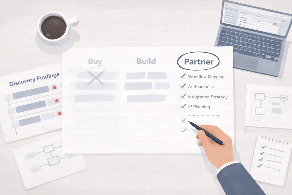
Buy, Build, or Partner
Bird's-eye desk: three-column decision matrix with "Buy" crossed out, "Partner" circled. Discovery findings with red flags at left, checklist at right, coffee cup. The focal artifact instantly communicates the article's conclusion: partner wins the evaluation.
Leveraging AI for ROI in Healthcare
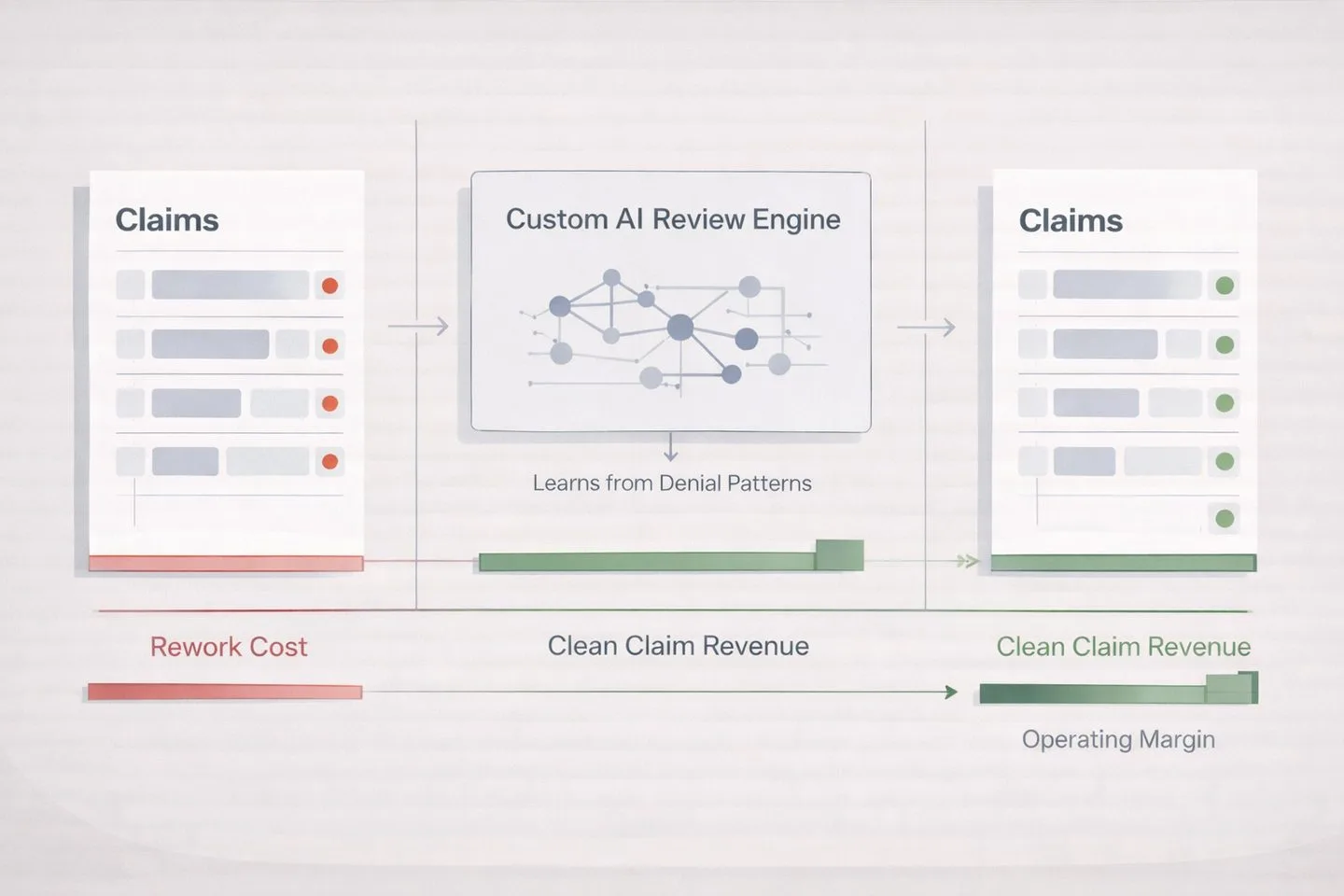
Left-to-right flow: red-flagged claims → "Custom AI Review Engine" (learns from denial patterns) → green-validated claims. Rework cost bar shrinks, clean claim revenue grows. The transformation tells the argument: AI turns claims denials into revenue.
Technology Priorities for Post-Acute Providers
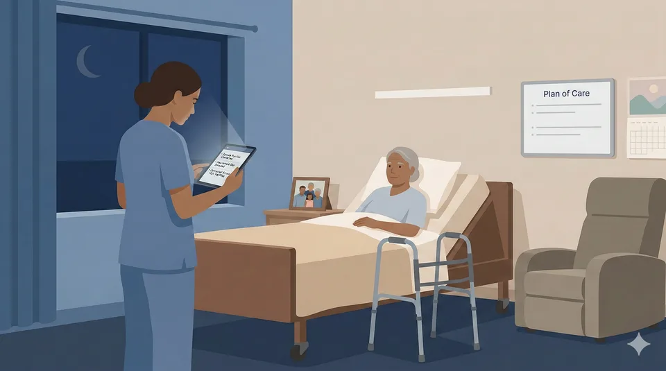
Single nurse at a patient bedside during a nighttime virtual care visit in a skilled nursing facility. Warm bedside light, cool ambient glow from the tablet. The focal element (the tablet connecting provider to patient) communicates the argument: technology enables better care at the point of need.
What does NOT meet the standard +

Cost Containment Strategies for Healthcare (before)
Generic stock photo. Glowing holographic graphs, neon effects, floating icons. Could appear on any competitor's site.
Why it fails:
- ✕ Illustrates "healthcare + data" (the topic), not the article's argument
- ✕ Neon/holographic effects violate "no visual slop" rule
- ✕ No focal artifact — no single element communicates a conclusion
- ✕ Generic enough for any healthcare company's blog
Four Composition Types
A — Partnership Scene
Two figures examining a shared artifact (dashboard, document, architecture diagram). Communicates collaboration and evaluation.
B — Decision Desk
A single desk or workspace with documents, data artifacts, and decision indicators. Communicates analysis and strategic thinking.
C — Lifecycle View
A process flow showing stages or transformation. Communicates methodology and progression.
D — Minimal Boardroom
Clean, sparse setting with a single focal artifact. Communicates authority and simplicity. Best for opinion/strategy pieces.
Artifact Layer System
| Layer | Count | Purpose | Examples |
|---|---|---|---|
| Level 1: Focal Artifact | 1 (required) | Communicates the article's argument | Chart with highlighted metric, document with annotations, dashboard with verdict |
| Level 2: Context Artifacts | 2–3 | Supporting documents/objects | Open folder, data printout, comparison sheet |
| Level 3: Environmental | 1–2 (optional) | Set the scene | Coffee cup, pen, notepad, plant |
Visual Storytelling Through State
Red gaps
Problems found
Amber flags
Under review
Green checkmarks
Validated / approved
Strikethrough / muted
Rejected options
Prompt Construction Template & Generator Notes
When generating blog hero images, use this prompt structure:
Flat vector illustration, muted corporate palette (slate blues, warm grays, cream).
[Composition type]: [describe scene].
Focal artifact: [describe the Level 1 artifact that communicates the argument].
Context artifacts: [2-3 supporting items].
Status indicators: [specific colors/states to show].
Style: Clean lines, no gradients, no 3D effects, no neon, executive tone.
16:9 aspect ratio, suitable for blog hero at 1440x810px.
What to Avoid
- ✕ Glowing arrows, neon gradients, 3D effects, cyber grids
- ✕ Gears, cogs, or "innovation" stock imagery
- ✕ Fake dashboards with random data
- ✕ Tron-style grids or neon networks
- ✕ More than 3 labels + 1 title of text in the image
Generator Notes
Nana Banana is the preferred tool — provide existing blog hero images as style reference for visual consistency. ChatGPT (DALL-E) is an alternative that handles muted flat vector well but struggles with precise text rendering.
Both tools need explicit emphasis instructions ("make this element the brightest/largest in the scene"). Test by removing text — if the image collapses, you're relying on text instead of visuals. All outputs are PNG (1.5–3 MB) — always resize to 1440px wide and convert to WebP before committing.
Photography Guidelines
Photography categories adapted from the 2019 brand guidelines, updated for current brand tone. All photography should feel executive, modern, and intentional.
Abstract / Conceptual
Macro shots, textures, patterns. Used for section backgrounds or decorative purposes. Should feel scientific and precise, not generic stock.
Culture / Team
Candid workplace shots. Real team members in natural settings. No posed "pointing at whiteboard" photos. Authentic over polished.
Product / Screenshots
Device mockups showing real product work. Must be sanitized (see below). Placed in browser/device frames when possible.
Dynamic Stills
Action-oriented shots that imply motion or process. Lab equipment, hands working, screens with data. Should feel alive, not static.
Screenshot Sanitization Checklist
Before publishing any screenshot, verify the following have been removed or obscured:
- ☐ Real patient names or any PHI (Protected Health Information)
- ☐ Unapproved internal system names
- ☐ Confidential labels, watermarks, or internal URLs
- ☐ Anything marked "draft," "internal only," or "confidential"
- ☐ Real email addresses or phone numbers
When in doubt, blur it or replace with test data.
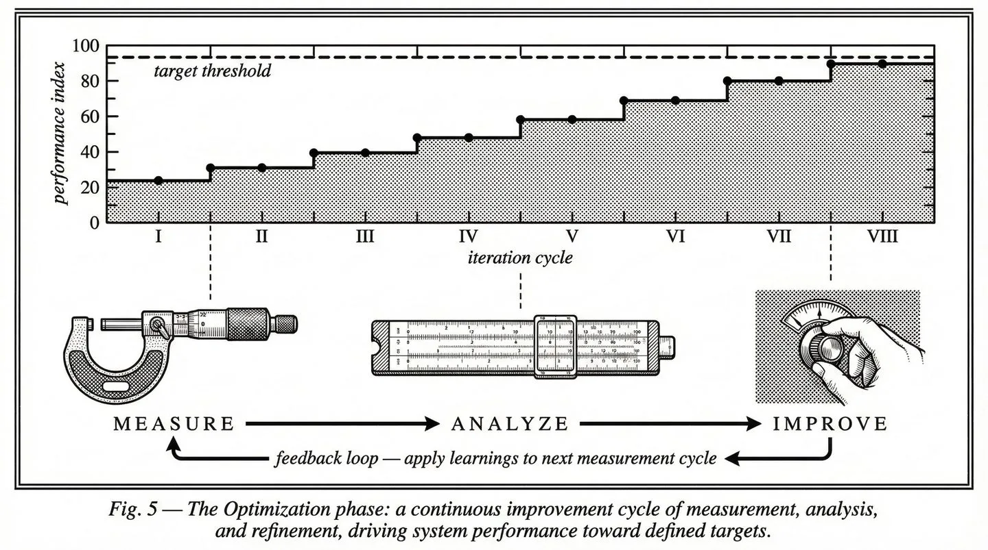
Part 3 — Imagery
METHOD Illustration Standard
Formal process diagrams in the aesthetic of 1950s–60s scientific and engineering textbook figure plates. A different visual language from blog heroes — scholarly, precise, and monochromatic.
General Aesthetic
Restraint and Precision
Published illustrations — precise, informational, elegant in restraint. Every line earns its place.
Scholarly Tone
Scholarly, timeless, quietly authoritative. Diagrams that reward close inspection rather than demanding attention.
1950s Optimism
Authentic optimism regarding science, industrial automation, and technological progress. Not retro pastiche — genuine belief in method.
Contrast, Tone & Media
Critical — These rules are non-negotiable
- ■ Pure White Background: #FFFFFF — like bright copy paper under fluorescent light. No cream, no off-white.
- ■ Dense Black Ink: True black #000000, full coverage, no fading. Maximum ink density.
- ■ Pristine Original Print: First-run letterpress impression, NOT a vintage scan. No aging artifacts.
- ■ Zero Noise: No texture, grain, noise, or yellowing. Gray washes are prohibited.
- ■ Monochromatic Constraint: Pure black on pure white. Maximum contrast. No color, no gray tones.
Layout & Structural Elements
- ✓ Landscape orientation with thin-thick-thin triple rule border
- ✓ Typeset serif fonts: Garamond, Caslon, or Century Schoolbook — never casual handwriting
- ✓ Title integrated into caption at bottom, not as a large header
- ✓ Figure caption: formal, centered, italic serif
- ✓ Technical labels: small, spaced serif capitals. Annotations in italics.
Rendering Technique
- ✓ Fine pen-and-ink style (Encyclopaedia Britannica, patent drawings)
- ✓ Stipple shading and cross-hatching only — no soft gradients
- ✓ Crisp, confident, mechanical linework. Connector lines orthogonal.
- ✓ Precise ruled axes. Sequence markers: small Roman numerals.
Four Diagram Archetypes
Refined Iterative Circular
METHOD Cycle
Nodes placed on a circle at 90° intervals, connected by curved clockwise arrows. Transition annotations between nodes describe phase outputs.
Branching Flowchart
Decision Flows
Left-to-right layout with diamond decision points and diverging paths. Binary branching with clear labels at each junction.
Layered System Architecture
Tech Stacks
Cross-section or exploded view showing structured layers. Stratum line with tick marks. Each layer labeled with small spaced capitals.
Performance / Scientific Charts
ROI & Metrics
Precise ruled axes, stepped data lines, target thresholds as dashed horizontals. Stipple area fill below curves. Annotation callouts for key inflection points.
Current METHOD Images
All images: 1440×803px, WebP, pure B&W, under 200 KB.
Fig. 1 — Overview · Iterative circular archetype · hero-method.webp
Fig. 2 — Discover · Radial cardinal
Fig. 3 — Experiment · Branching flowchart
Fig. 4 — Engineer · Layered architecture
Fig. 5 — Optimize · Performance chart
Processing & Generation Notes
Quality: Export at quality 90+ (not the standard 82). These illustrations require higher fidelity to preserve fine linework and stipple detail.
Generator: All METHOD illustrations are generated with Nana Banana (ChatGPT image generation). Provide existing METHOD images as style reference for visual consistency.
Prompts: Full prompt history and construction templates are documented in ds-method-illustration-prompts.md in the repo root.
Part 4: Site Design System
Page Architecture
Every page follows the same structural pattern. The gold standard reference is healthcare/index.html.
Standard Body Structure
<body class="bg-white text-dsBlack antialiased">
  <div id="ds-nav-slot"></div>

  <header class="pt-32 pb-16 px-6">...</header>

  <section class="py-20 px-6 bg-dsGray">
    <div class="max-w-screen-xl mx-auto">...</div>
  </section>

  <section class="py-20 px-6">              <!-- white -->
    <div class="max-w-screen-xl mx-auto">...</div>
  </section>

  <section class="py-20 px-6 bg-dsGray">    <!-- gray -->
    <div class="max-w-screen-xl mx-auto">...</div>
  </section>

  <div id="ds-footer-slot"></div>
</body>
Section Pattern
Alternating Backgrounds
bg-white and bg-dsGray alternate. Special sections (dsBlue, dsBlack, dsTeal, dsLime backgrounds) are skipped in the alternation count.
Content Constraint
max-w-screen-xl mx-auto (1280px max). Backgrounds extend edge-to-edge; content is centered.
Spacing
py-20 px-6 on sections (80px vertical, 24px horizontal padding).
Required Files
| File | Purpose |
|---|---|
| ds-includes.js | Auto-detects base path, loads nav/footer |
| includes/nav.html | Shared navigation (desktop + mobile) |
| includes/footer.html | Shared footer |
| ds-nav.css | Nav and footer styles (~280 lines) |
| ds-wp-layout.css | WP→DS layout bridge (~3,400 lines) |
| ds-wp-interactivity.js | Swiper, FAQ accordion, tab switching, alternating bg |
| search-index.json | Site-wide search data |
Component Library
Live-rendered examples of the DS design system components. All use Tailwind utility classes — no custom CSS required.
Buttons — Three Tiers
View button code
<!-- Tier 1: Primary Filled -->
<a class="inline-flex items-center gap-2 bg-dsBlue text-white
px-6 py-3 text-sm font-medium rounded-full
hover:bg-dsBlack transition">
Start The Experiment →
</a>
<!-- Tier 2: Outline -->
<a class="inline-flex items-center gap-3 border-2 border-dsBlack
text-dsBlack px-6 py-3 rounded-full font-medium uppercase
hover:bg-dsBlack hover:text-white transition-all">
VIEW CASE STUDY →
</a>
<!-- Tier 3: Text Link -->
<a class="inline-flex items-center gap-2 text-dsBlue font-semibold
text-sm uppercase tracking-wider
hover:gap-3 transition-all">
View All →
</a>Cards
Stat card pattern. Bold metric with supporting context. Hover highlights border in dsBlue.
Healthcare
Image Card Example
Image cards use aspect-video for 16:9 ratio. Image scales 105% on group hover.
"Testimonial cards use italic quote text, followed by an author row with avatar, name, and title."
View card code patterns
<!-- Standard/Stat Card -->
border border-gray-200 rounded-xl p-6 hover:border-dsBlue hover:shadow-sm

<!-- Image Card -->
bg-white rounded-xl overflow-hidden border border-gray-200
  Image: aspect-video object-cover, group-hover:scale-105
  Body: p-6
  hover:border-dsBlue hover:shadow-lg

<!-- Testimonial Card -->
border border-gray-200 rounded-xl p-8
  Quote: text-gray-600 italic mb-6
  Avatar: w-12 h-12 rounded-full
  Name: font-semibold text-dsBlack
  Title: text-gray-500 text-sm
Pills & Labels
View pill code
inline-block bg-dsBlue/10 text-dsBlue text-xs font-medium
px-3 py-1 rounded-full uppercase tracking-wider
Section Labels
Section Label Example
Heading Following Label
View label code
text-xs font-medium text-dsBlue uppercase tracking-widerGrid Patterns
Standard grids: grid md:grid-cols-2 gap-6 or grid md:grid-cols-3 gap-6. Cards use lg:grid-cols-3 for later breakpoint.
FAQ Accordion
How does the FAQ accordion work? +
<details> element with a <summary>. The + icon rotates to × when open. Background is white on dsGray sections.What about Swiper carousels? +
ds-wp-interactivity.js which auto-detects .swiper containers.CTA Architecture
Every page must end somewhere useful. The CTA system uses three intent tiers to match the visitor's readiness level.
Three CTA Tiers
Start The Experiment
Links to /proof/. Solid dsBlue filled button. Used for visitors ready to engage — case study CTAs, healthcare pages, pricing discussions.
Start a Conversation
Links to /start/. Outlined button. Used for visitors exploring — service pages, blog posts, general inquiries.
Learn More / Assess
Links to service pages or assessment tool. Text link with arrow. Used for early-stage visitors — blog inline CTAs, sidebar prompts.
Take the AI Readiness Assessment →CTA Copy Rules
Use These
- ✓ "Start The Experiment"
- ✓ "Start a Conversation"
- ✓ "Discuss Your AI Opportunity"
- ✓ "Schedule AI Opportunity Call"
- ✓ "See More Healthcare Case Studies"
Retired Phrases
- ✕ "Learn More" (as a button — acceptable as text link)
- ✕ "Get In Touch" → use "Start a Conversation"
- ✕ "Contact Us" as button → OK as page heading only
- ✕ "Click Here"
- ✕ "Submit" (on forms — use specific action verb)
Form Infrastructure
Formspree
All site forms use Formspree Professional ($30/mo). Native Pipedrive plugin auto-creates leads. Custom fields per page. Spam protection. All forms include a _next hidden field pointing to the thank-you page.
Calendly
Embedded via button links (not inline embeds). Used on the thank-you page and as an alternative conversion path on high-intent pages.
/proof/ and a continue-exploring CTA ("See More Healthcare Case Studies") linking back to the portfolio.
Part 5: Content Standards
Case Study Standards
Based on analysis of 44 case studies. Portfolio headline average was 4.2/10 — 70% had no numbers, 61% lacked outcome verbs. These standards fix that.
Headline Formula
Use 3–4 of these elements. Target: 10–18 words.
Metric / Scale
26,000+ patients, $10M revenue, 150M tickets, 75 days
Outcome Verb
built, launched, reduced, recovered, transformed, shipped
Specific Deliverable
platform, EHR, mobile app, dashboard, API, ML pipeline
Industry / Client
healthcare, HIPAA-compliant, McKesson, nuclear
Strong example: "ML-powered brand intelligence that generated 4.8M design suggestions for Mailchimp"
Weak example: "Building a better healthcare experience" (no metrics, no specifics, no outcome verb)
Page Structure (Required)
| Section | Requirements |
|---|---|
| H1 Headline | One H1 per page. Uses the headline formula. Critical — currently missing from all legacy pages. |
| Challenge | Name the industry. Quantify the pain points. State what happens if unsolved. |
| Our Approach | Name the methodology (Discover/Experiment/Engineer/Optimize). Describe key decisions. |
| What We Built | Name technologies explicitly. Show architecture decisions. Include screenshots/mockups. |
| The Results | Lead with strongest metric. Include client testimonial. Dual-path CTA. |
Quantified Proof
Every case study needs ≥3 citable metrics. Rule: "Quantify the input if you can't quantify the output."
Metric Categories
- Business outcomes: revenue impact, cost reduction, time savings
- Scale indicators: patient/facility counts, transactions processed
- Process proof: days to launch, interviews conducted, apps analyzed
- Technical specificity: model accuracy, API response time, uptime %
Reference Proof Points
- Never Alone: 135+ SNFs, 800+ devices, 96% treat-in-place, 3-min response
- MDS Optimization: $10M PDPM revenue, 95% reduction in discrepancies
- RAF Score: $2.4M+ annual revenue, 12-week build, 98% clinician adoption
- HealthContext.AI: 100K+ AI-documented encounters, 90-day MVP
LLM Search Citability
High Citability
- ✓ Named technologies (React Native, FHIR, HL7)
- ✓ Specific metrics ($2.4M revenue impact)
- ✓ Industry terminology (HIPAA, PDPM, VBC, CMS)
- ✓ Attributed quotes with names/titles
- ✓ Clear problem → solution → result structure
Low Citability
- ✕ "Modern tech stack" (name it)
- ✕ "Significant improvement" (quantify it)
- ✕ "A major healthcare company" (name the client or domain)
- ✕ Vague outcomes without numbers
- ✕ Generic paragraphs with no structure
Blog Standards
Blog content should demonstrate expertise and drive organic traffic. Target: 2–4 posts per month.
Taxonomy
Content Expectations
| Element | Requirement |
|---|---|
| Length | 1,000–2,500 words for thought leadership; 500–1,000 for news/updates |
| Hero Image | Required. Must follow the Blog Hero Image System (Section 14). 1440×810px, WebP, <200KB. |
| Lead Paragraph | State the argument in the first 2 sentences. Don't bury the lede. |
| Structure | H2 subheadings every 300–400 words. Use lists and tables for scanability. |
| CTA | Every post must end with a CTA. Healthcare posts → Tier 1 (/proof/). General posts → Tier 2 (/start/). |
| Author | Named author with title. No "DS Team" bylines. |
SEO Per Post
Required
- ☑ Title tag (50–60 chars, includes primary keyword)
- ☑ Meta description (120–160 chars)
- ☑ One H1 tag (matches or extends title)
- ☑ OG image (blog hero, 1200×630 minimum)
- ☑ Canonical URL
- ☑ 2+ internal links to related content
Best Practices
- • Primary keyword in first 100 words
- • Alt text on every image (include topic keyword)
- • URL slug matches primary keyword
- • JSON-LD Article schema
- • Cross-link to related case studies when applicable
SEO Guidelines
SEO strategy based on Google Search Console data. Position has improved from 48 to 28; the focus now is on CTR improvement and filling content gaps.
Target Keywords by Tier
| Tier | Description | Examples |
|---|---|---|
| Tier 1 | High volume, already ranking <30 — optimize now | healthcare software development, custom healthcare platform, medical app development |
| Tier 2 | Huge volume, position 30–60 — content gaps to fill | AI in healthcare, healthcare AI solutions, clinical AI documentation |
| Tier 3 | VBC-specific / emerging opportunity | value-based care technology, PDPM optimization, RAF score improvement |
On-Page SEO Checklist
Content Strategy Principles
- Lead with the problem, not the technology
- Use specific numbers — "$10M PDPM revenue" beats "significant revenue improvement"
- Name technologies explicitly — "React Native + FHIR R4" beats "modern tech stack"
- Clear CTAs on every page
- Internal linking: Every blog post links to ≥1 case study and ≥1 service page
- Cross-link domains: Healthcare → AI, AI → Healthcare
- Hub pages (healthcare, ai) link to all sub-pages in their domain
- Case studies link to related service pages and vice versa
Part 6 — Marketing Channels
LinkedIn is DS's primary social platform. Every post and graphic must feel deliberate, expert, and on-brand.
Two Accounts, Two Voices
Bob Klein (Personal)
Opinionated • Story-driven • First person
1×/week. Thought leadership, relationship building. Personal stories → lessons → DS capability proof.
DS Company Page
Expert • Generous • Data-backed
1×/week. Brand authority, content distribution. Outcomes, frameworks, case proofs.
Image Specifications
| Type | Dimensions | Ratio | Format | Notes |
|---|---|---|---|---|
| Profile image | 400×400 | 1:1 | PNG | DS wordmark on white |
| Company cover | 1128×191 | ~6:1 | PNG | Black bg, pixel extractions, blue/teal accents |
| Personal cover | 1584×396 | 4:1 | PNG | Same language as company cover |
| Single post (square) | 1200×1200 | 1:1 | PNG | High engagement format |
| Single post (landscape) | 1200×627 | ~1.91:1 | PNG | Standard format |
| Carousel slide | 1080×1350 | 4:5 | PDF/PNG | Best engagement format |
Post Graphic Templates
Quote Card
“We reduced clinician documentation time by 40% in the first quarter.”
— VP of Clinical Operations
dsBlack bg, white Inter Bold quote, dsBlue accent bar. DS logo small, bottom-right.
Data Callout
$10M+
recovered PDPM revenue across 20,000+ patients
One number, one idea. dsBlue metric, minimal design. Source attribution at bottom.
Framework Graphic
2–4 column comparison. dsBlue highlights recommended option. Based on “argument over topic” principle.
Case Proof
40%
reduction in documentation time
Skilled NursingLead metric, one-line context, industry tag (not client name unless approved).
Carousel Standards
5–10 slides per carousel (sweet spot: 7). Page numbers on each slide. Cover must hook without requiring swipe.
5 Signs Your EHR Integration Is Costing You Money
Bob Klein · Digital Scientists
1 / 7
01
Manual data entry still required
If clinicians are copying data between systems, your integration is decorative, not functional.
2 / 7
02
No real-time data sync
Batch processing means decisions are always based on stale data. That’s a clinical risk.
3 / 7
See how we fixed this for 3 health systems.
digitalscientists.com/healthcare
7 / 7
Post Formats
Narrative Arc
Bob’s voice. Personal story → lesson → DS capability proof.
Contrarian Take
Bold statement challenging industry conventional wisdom.
Case Proof
Lead with metric, expand with context, link to full case study.
Framework Share
Teach a mental model or evaluation framework.
Industry Observation
Timely commentary on healthcare/AI news.
Behind the Build
How we solved a specific technical challenge.
Anti-Patterns
Do Not
- ✕ Emoji walls (3+ in a row, or emoji as bullet points)
- ✕ “Agree?” bait or engagement farming
- ✕ Generic stock photos as post images
- ✕ Canva templates with multiple fonts/colors
- ✕ “I’m humbled to announce...” humblebrags
- ✕ Reposting content without adding original commentary
- ✕ Hashtag stuffing (max 3–5 relevant hashtags)
- ✕ Tagging people who aren’t mentioned in the content
Part 6 — Marketing Channels
Email Marketing
Email is a high-frequency brand touchpoint. Every send reinforces or undermines perception. These standards ensure every message from Digital Scientists looks intentional, loads reliably, and renders correctly across clients.
Email Layout
600px
Max width, centered.
#FFF
White background on body.
20px
Side padding (left & right).
24–32px
Spacing between content blocks.
Typography
| Element | Size | Weight | Color |
|---|---|---|---|
| Heading | 24–28px | Bold | #050505 dsBlack |
| Subheading | 18–20px | SemiBold | #050505 dsBlack |
| Body | 16px | Regular | #4B5563 |
| Caption | 14px | Regular | #6B7280 |
Font stack: Arial, Helvetica, sans-serif — system fonts only. Web fonts are not reliably supported in email clients.
CTA Buttons
Light background (default)
background-color: #304FFF;
color: #FFFFFF;
padding: 12px 24px;
border-radius: 24px;
font-weight: 500;
font-size: 14px;
text-decoration: none;
Dark section variant
background-color: #FFFFFF;
color: #304FFF;
padding: 12px 24px;
border-radius: 24px;
font-weight: 500;
font-size: 14px;
text-decoration: none;
Example Email Layout
New case study: $10M recovered in PDPM revenue
See how we helped a multi-site skilled nursing operator identify and recover lost reimbursement using custom AI documentation tools.
Read the Case StudyDigital Scientists · 21 S Main St, Alpharetta, GA
Header / Banner
Banner Dimensions
- ✓ 600px wide, full bleed
- ✓ Keep header height under 200px
- ✓ Optional hero image under 100KB
Logo Placement
- ✓ DS logo top-left or centered
- ✓ White logo on dsBlack or dsBlue background
- ✓ dsBlack logo on white background
Email Signature
First Last / Title
Digital Scientists
(555) 123-4567 | first@digitalscientists.com
digitalscientists.com
[ DS wordmark — small ]
- ✓ DS wordmark, small (not the full logo)
- ✕ No social media icon rows
- ✕ No banner images
Anti-Patterns
Do Not
- ✕ Use custom web fonts — they fail silently in most email clients
- ✕ Build complex multi-column layouts — single column or simple 2-col max
- ✕ Use dark-mode-breaking colors (e.g., black text on transparent background)
- ✕ Send images without alt text
- ✕ Embed video in email — link to it instead
- ✕ Use background images on buttons — use solid
background-color
Part 6 — Marketing Channels
Presentations
Google Slides and PowerPoint are client-facing brand artifacts. Every deck should feel deliberate, data-forward, and unmistakably DS. These standards apply to all external presentations — sales decks, capability overviews, case study walkthroughs, and conference talks.
Slide Dimensions
16:9
1920 × 1080px. Widescreen only. Never 4:3.
Background Colors
| Slide Type | Background | Text Color |
|---|---|---|
| Content / body | White #FFFFFF | dsBlack |
| Section divider | dsBlack #050505 | White |
| Title slide | dsBlack #050505 | White |
| CTA / contact | dsBlue #304FFF | White |
| Feature highlight | dsGray #F5F5F5 | dsBlack |
Typography
| Element | Font | Size | Weight | Notes |
|---|---|---|---|---|
| Slide title | Inter | 36–44pt | Bold | -0.02em tracking |
| Subtitle | Inter | 20–24pt | Regular | -0.02em tracking |
| Body | Inter | 18–24pt | Regular | |
| Caption | Inter | 14pt | Regular | |
| Data / metrics | Inter or Roboto Mono | 44–72pt | ExtraBold | Hero numbers |
| Labels | Inter | 12–14pt | Medium | Uppercase |
All headings use letter-spacing: -0.02em. Roboto Mono is reserved for data labels and metric callouts.
Standard Slide Types
Healthcare AI
Capabilities
Digital Scientists · 2026
Title Slide
dsBlack bg, white logo, bold title, subtitle in gray-400
Why Digital Scientists
1 100% healthcare AI production rate
2 $20M+ verified client ROI
3 Same-timezone nearshore team
4 HIPAA compliant operations
Value Proposition
White bg, numbered list with dsBlue numbers
$10M+
recovered PDPM revenue
Case Study
Lead with hero metric in dsBlue at 44pt+
Our Capabilities
AI Dev
Design
Product
Platform
Testing
DevOps
Service Overview
Icon grid on white or dsGray bg
Our Approach
Section Divider
dsBlack bg, pixel extraction accent allowed
Let’s talk.
Bob Klein, CEO · Nick Alexander, COO
bob@digitalscientists.com
CTA / Contact
dsBlue bg, white text, DS logo
Chart & Data Visualization Colors
| Role | Color | Value |
|---|---|---|
| Primary | dsBlue | #304FFF |
| Secondary | dsTeal | #26D9C4 |
| Tertiary | dsLime | #D1F259 |
| Neutral | Gray-400 | #9CA3AF |
| Axis / gridlines | Gray-200 | #E5E7EB |
| Labels | dsBlack | #050505 |
Maximum 4 colors per chart. Use Roboto Mono for data labels and axis values.
Current Example: Healthcare Capabilities 2026
The most current sales deck. 16 slides, 16:9. Note the consistent patterns: dsBlack cover/closing with pixel logomark grid (gradient dsBlue→dsTeal), dsGray content slides, dsBlue pills for tags, monospace “CASE STUDY //” labels, Inter Light headlines.
Cover — dsBlack + pixel grid + gradient logomarks
Overview — dsGray bg + office photo + Top 5 list
HIPAA — dsGray bg + compliance wheel diagram
Team — experience metrics in dsBlue circles
Why Us — diagonal split dsGray/dsBlue + dsLime accents
AI Cases — 4-up case study cards with screenshots
Case Study — product screenshots + dsBlue tags
Case Study — journey map + UI detail
Testimonial — full-bleed video still + CTA
Closing — dsBlack + headshots + schedule CTA
Deck Design Patterns (from this example)
- • Cover/Closing: dsBlack background with repeating pixel logomark grid; logomarks use gradient (dsBlue→dsTeal at edges)
- • Content slides: dsGray (#F5F5F5) or white background, Inter Light/Regular headlines, dsBlue accent elements
- • Case study slides: “CASE STUDY //” in dsBlue monospace, client logo, product screenshots, dsBlue tag pills at bottom
- • Metrics: Hero numbers in dsBlue (large), supporting text in gray
- • Footer: DS wordmark bottom-left + “proprietary & confidential” bottom-right (monospace)
- • Accent colors: dsLime for callout boxes and highlighted text; dsTeal sparingly
Anti-Patterns
Do Not
- ✕ Use WordArt or decorative text effects
- ✕ Use stock clip art — use DS-approved icons or no icons
- ✕ Apply gradient backgrounds to slides
- ✕ Exceed 3 bullet points per section — split the slide if needed
- ✕ Create walls of text — slides are not documents
- ✕ Use transition animations beyond a simple fade
- ✕ Mix multiple fonts on a single slide (Inter + Roboto Mono for data is the only exception)
Part 6 — Marketing Channels
Sales Collateral
Every piece of sales collateral is a brand touchpoint. It must feel like DS built it — precise, evidence-led, and visually clean.
One-Pagers
Format: 8.5×11" US Letter, 0.75" margins, Inter font, dsBlue accent.
Required Structure
- Header — DS logo + title + dsBlue accent bar
- Value Proposition — 1–2 sentences, bold
- Key Capabilities — 3–5 items with icons or checkmarks
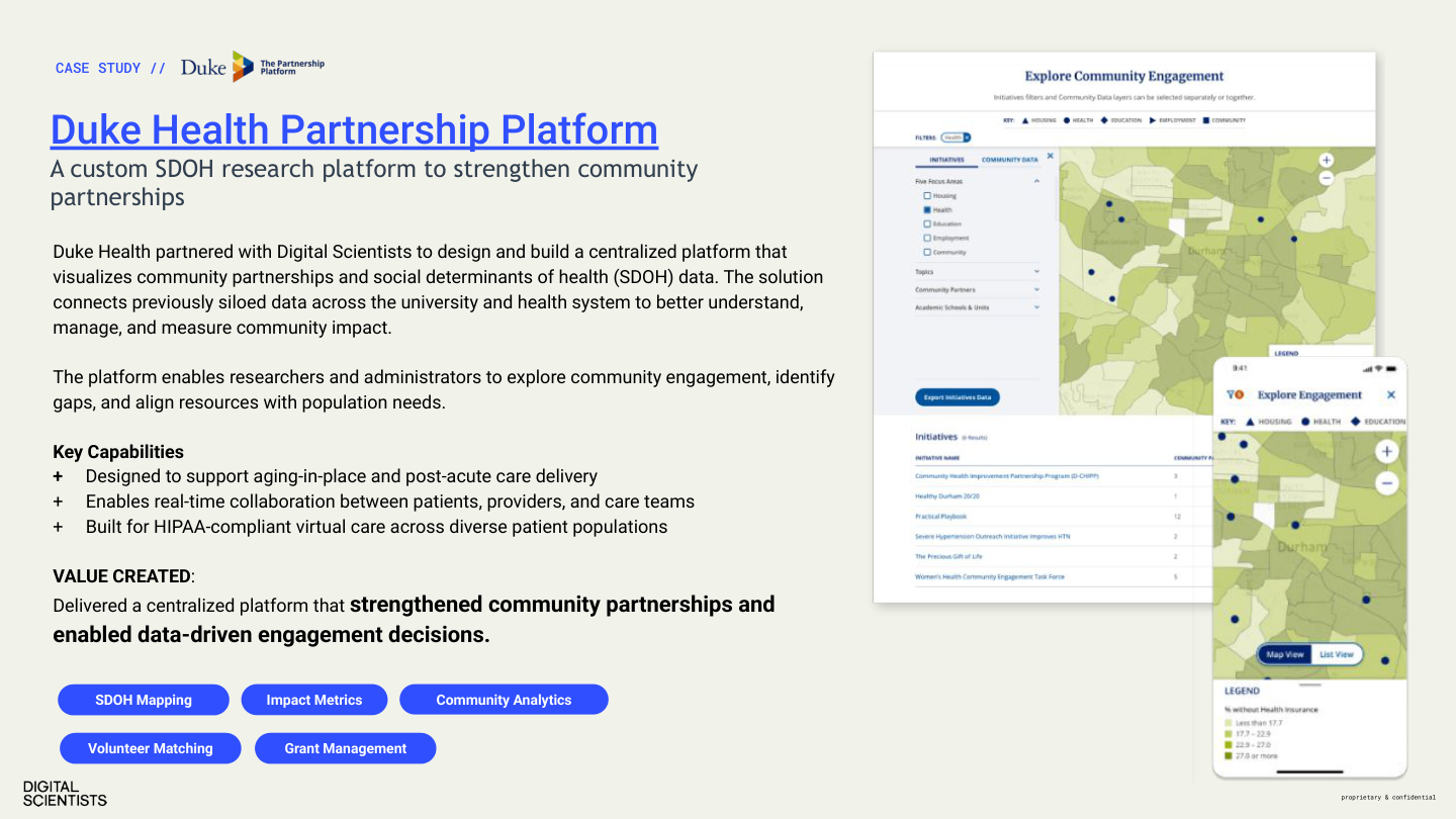
- Proof Point — Lead metric + context (e.g., “$10M recovered PDPM revenue”)
- CTA — Contact info and next step
Case Study PDFs
Case Study
$10M+
recovered PDPM revenue across 20,000+ patients
Challenge
Multi-site SNF operator losing revenue due to inconsistent MDS coding and documentation gaps.
Approach
AI-powered documentation analysis + real-time clinician feedback loop. METHOD phases: Discover → Experiment → Engineer.
Results
Format: Challenge → Approach → Results. 1–2 pages max.
| Section | Content |
|---|---|
| Header | DS logo + “Case Study” label + client industry |
| Hero Metric | Large dsBlue number — lead with result |
| Challenge | 2–3 bullets describing the problem |
| Approach | What DS did, METHOD phases referenced |
| Results | 3–5 measurable metrics |
| Tech Stack | Tags for frameworks, platforms, tools |
| CTA | Next step + contact information |
Include real screenshots (sanitized). The METHOD diagram may be used as a visual accent.
Proposals
Required Elements
- ✓ Cover page: DS wordmark, proposal title, client name, date, dsBlue accent
- ✓ Section headers: Inter Bold, dsBlue underline
- ✓ Body: Inter Regular 11–12pt, 1.5 line height
- ✓ Page numbers: Bottom-center, gray-500
- ✓ METHOD integration where relevant to project phasing
Formatting Rules
- Font: Inter only (Regular, SemiBold, Bold)
- Headings: dsBlue (#304FFF) underline accent
- Body text: 11–12pt, 1.5 line spacing
- Margins: Standard (1" or 0.75")
Anti-Patterns
✗ Word/Docs defaults
No Calibri, Times New Roman, or system fonts.
✗ Clip art
No stock clip art, SmartArt, or WordArt.
✗ Dense paragraphs
No walls of text without visual hierarchy.
✗ Inconsistent headings
One heading style per document level.
Part 6 — Marketing Channels
Stationery
Every physical touchpoint reinforces the DS brand. Stationery is matte, minimal, and typographically precise.
Business Cards
Current production design (MOO, 200 qty). The front uses the signature DS pattern; the back is clean monospace contact info.
Front
- ✓ dsBlack (#050505) background
- ✓ Repeating pixel logomark grid (white, evenly spaced)
- ✓ “DIGITAL SCIENTISTS” wordmark, white, bottom-left
- ✓ “digitalscientists.com” rotated 90° on right edge
Back
- ✓ White background, clean and minimal
- ✓ All-lowercase text in Roboto Mono
- ✓ Name (bold), title, address, phone (o:/m:/e: format)
- ✓ No logo on back — the front carries the brand
Format: 3.5×2" standard US. Matte finish. Front: dsBlack + pixel logomark grid + wordmark. Back: Roboto Mono — name (Medium), title/contact (Regular 7pt). Printed via MOO.
Digital Letterhead
Header
- ✓ DS wordmark top-left
- ✓ dsBlue rule below header
Body
- ✓ Inter Regular 11pt
- ✓ 1.5 line height
Footer
- ✓ Address, phone, email, website
- ✓ gray-500, 8pt
Margins
- ✓ 1" top/bottom
- ✓ 0.75" sides
Note Cards
Current production design (MOO, 50 qty). The front is intentionally blank for handwritten notes; the back carries the DS brand pattern.
Front
- ✓ Blank white — writable surface for handwritten messages
- ✓ No logo, no text, no accent
Back
- ✓ dsBlack (#050505) background
- ✓ Repeating pixel logomark grid (same pattern as business card front)
- ✓ “DIGITAL SCIENTISTS” wordmark, white, bottom-left
- ✓ “digitalscientists.com” rotated 90° on right edge
Format: A2 (4.25×5.5"). Heavy card stock, matte finish. Printed via MOO.
Anti-Patterns
✗ Non-brand fonts
No Calibri, Times New Roman, or Helvetica Neue.
✗ Color deviations
Use only approved DS palette values.
✗ Low-res logos
Always use vector (SVG/PDF) for print.
✗ Glossy/metallic
Matte is the DS aesthetic. No exceptions.
Part 6: Publishing & Operations
How the Site Works
Plain-language explanation for anyone who needs to understand the site infrastructure. No CMS, no database, no build step.
HTML Files
The site is static HTML files in a GitHub repository. Each page is a .html file. Files are the site — what you see in the repo is what gets deployed.
GitHub → Netlify
Push to the main branch and Netlify deploys automatically. No build step. Deploys take ~30 seconds. Served via Cloudflare CDN.
No CMS
No WordPress, no database, no admin panel. Content changes are code changes. This makes the site extremely fast, secure, and version-controlled.
Content Types & Typical Turnaround
| Content Type | Frequency | Turnaround | Notes |
|---|---|---|---|
| Blog Posts | 2–4/month | 1–2 days | Content + hero image + taxonomy + search rebuild |
| Case Studies | 1–2/quarter | 3–5 days | Asset gathering is the bottleneck (screenshots, metrics, quotes) |
| Landing Pages | As needed | 2–3 days | New page from the design system components |
| Quick Edits | As needed | Same day | Text changes, image swaps, CTA updates |
Cache Policy
Cache headers are set in netlify.toml and control how long Cloudflare and browsers hold onto files before checking for updates. Getting this wrong can cause deploys to be invisible for hours or days.
| File Type | Cache-Control | Meaning |
|---|---|---|
| HTML (.html, /) | max-age=0, must-revalidate | Always check origin. Pages update immediately after deploy. |
| JS (.js) | max-age=3600, must-revalidate | Cache 1 hour, then recheck. Updates visible within 60 minutes. |
| CSS (.css) | max-age=3600, must-revalidate | Cache 1 hour, then recheck. Updates visible within 60 minutes. |
| Images, fonts (.webp, .png, .jpg, .svg, .woff2) | max-age=31536000, immutable | Cache forever. Safe because image filenames don't change in place. |
ds-includes-v2.js, ds-nav.css) are edited in place and redeployed with the same filename. If Cloudflare caches them as immutable, updates become invisible until the cache expires (up to a year). This caused a 3-day outage of RB2B visitor tracking in March 2026. Only use immutable for files with hashed/versioned filenames that never change.
Content Security Policy (CSP)
The site sends a security header with every page that tells the browser exactly which external domains are allowed to load scripts, images, fonts, and make API calls. Anything not explicitly whitelisted gets blocked silently.
Why We Have It
CSP defends against cross-site scripting (XSS) and data injection attacks. If someone managed to inject malicious code into the site (through a form, a compromised third-party script, etc.), the CSP prevents that code from phoning home to an attacker's server or loading malicious scripts — because those domains wouldn't be on the whitelist.
This is especially important for a healthcare-focused site that handles contact forms and integrates with analytics, CRM, and visitor identification tools.
Where It Lives
The CSP is defined in netlify.toml at the repo root, inside the [[headers]] block for /* (all pages). It deploys automatically with every push to main.
What Each Directive Controls
The CSP is a single header string with multiple directives separated by semicolons. Each directive controls a different resource type.
| Directive | Controls | Currently Allowed |
|---|---|---|
| script-src | JavaScript execution | Our site, inline scripts, GTM, Google Analytics, StatCounter, Pipedrive, RB2B (S3 + app), CookieYes, Workable, jsDelivr CDN |
| connect-src | API calls (fetch, XHR) | Formspree, Pipedrive, Google Analytics, StatCounter, RB2B (app + AWS API Gateway), S3 |
| img-src | Image loading | Our site, data URIs, StatCounter pixels, YouTube thumbnails, Google/GTM pixels, RB2B, EventScribe, CDC |
| style-src | CSS loading | Our site, inline styles, jsDelivr CDN (Tailwind) |
| font-src | Font files | Our site only (Inter + Roboto Mono are self-hosted) |
| frame-src | Iframes / embeds | YouTube, Vimeo, SlideShare, Workable (job listings) |
| media-src | Video / audio files | Our site + media.digitalscientists.com (Cloudflare R2) |
| form-action | Form submission targets | Our site + Formspree |
| frame-ancestors | Who can iframe our site | Nobody ('none') — prevents clickjacking |
| object-src | Flash / plugins | Nobody ('none') |
Adding a New Third-Party Service
When onboarding a new tool (analytics, chat widget, CRM integration, etc.), its domains must be added to the CSP or the browser will silently block it. This is the most common gotcha.
-
1
Identify all domains the service uses. Check the vendor's docs or load the site with DevTools Console open — CSP violations show as red errors with the blocked domain name.
-
2
Add each domain to the correct directive(s) in
netlify.toml. A single service often needs multiple directives (e.g.,script-srcto load its JS,connect-srcto phone home,img-srcfor tracking pixels). -
3
Push and verify. Open the live site in incognito, open DevTools → Console. Zero CSP errors = working. Check the Network tab to confirm the service's requests return 200.
Other Security Headers
The CSP is the most complex header, but we also set four others in the same netlify.toml block:
| Header | What It Does |
|---|---|
| Strict-Transport-Security | Forces HTTPS for 1 year. Browsers remember and never attempt HTTP. |
| X-Frame-Options: DENY | Prevents other sites from embedding ours in an iframe (clickjacking protection). |
| X-Content-Type-Options: nosniff | Prevents browsers from guessing file types. A .css file is always CSS, never JavaScript. |
| Referrer-Policy | Only sends the origin domain (not full URL path) when linking to external sites. Protects page-level analytics data. |
| Permissions-Policy | Disables camera, microphone, and geolocation APIs. We don't need them and they're common attack vectors. |
Forms & CRM Integration
The website captures leads through two conversion paths — Formspree forms and Pipedrive Scheduler bookings — both routing into Pipedrive CRM with consistent campaign attribution. Scheduler bookings sync to Google Calendar automatically.
System 1
Formspree Forms
All web form submissions. Single endpoint (formspree.io/f/xvzbywbr), 20+ pages. Webhook creates Deal or Lead in Pipedrive.
System 2
Pipedrive Scheduler
Meeting bookings (replaced Calendly). Two-phase flow: pre-booking UTM capture + post-booking contact enrichment via webhook.
System 3
Google Calendar
Two-way sync with Pipedrive. Scheduler bookings appear on Bob’s calendar automatically. Pipedrive is the single source of truth.
The Attribution Rule
Pipedrive Leads do not support custom fields. UTM data can only be stored natively on Deals. So we use a consistent routing rule across all conversion paths:
| Visitor has UTMs? | Pipedrive Record | Why |
|---|---|---|
| Yes | Deal → Inbound Project → Marketing Qualified | UTM fields populated natively — filterable, sortable, reportable |
| No | Lead (inbox) | No attribution to store — qualify manually, convert to Deal |
Form Submission Flow
Step 1
Visitor fills out form. Hidden fields carry source page ID and UTM params (auto-injected by ds-includes-v2.js).
Step 2
Formspree receives submission. Stores data, sends email notification, fires webhook to Netlify Function.
Step 3
formspree-webhook.mjs runs. Finds/creates Person (by email) and Organization (by company) in Pipedrive.
Step 4
Deal or Lead created. Campaign traffic → Deal with UTM custom fields. Organic → Lead. Both get a pinned note with form details.
Scheduler Booking Flow
Because booking happens on Pipedrive’s domain (not ours), the integration runs in two phases:
Phase 1 — Pre-Booking
Visitor clicks “Schedule a Call” on our site. JS intercepts the click, reads UTMs from sessionStorage, and calls schedule-lead.mjs.
Campaign traffic: Creates a Deal with UTM custom fields (no person linked yet).
Organic: Passthrough — no Pipedrive action. Browser redirects to Scheduler.
Phase 2 — Post-Booking
Prospect enters details and picks a time on Pipedrive Scheduler. Pipedrive creates Person, Org, and Activity.
Webhook fires (scheduler-webhook.mjs): finds recent unlinked Deal → enriches with person, org, form text as pinned note.
No Deal found: Creates a Lead with person, org, and form text. Activity syncs to Google Calendar.
Where the Scheduler Appears
| Page | Format |
|---|---|
/start/ | Button (also has a Formspree form) |
/thank-you/ | Button (post-form CTA) |
/healthcare/assessment/ | Embedded iframe (in-page widget) |
/event/paltc26-annual-conference/ | 4 buttons (hero + pills + footer) |
/event/beckers-health-it-rcm-2026/ | 4 buttons (hero + pills + footer) |
/event/2026-nchcfa-annual-convention-expo/ | 1 button (footer) |
Technical Components
| Component | Purpose |
|---|---|
formspree-webhook.mjs | Form submissions → Deal (w/ UTMs) or Lead in Pipedrive |
schedule-lead.mjs | Pre-booking: creates Deal with UTM fields for campaign traffic |
scheduler-webhook.mjs | Post-booking: enriches Deal with person/org/note, or creates Lead |
ds-includes-v2.js | Frontend: captures UTMs, injects hidden fields, intercepts scheduler clicks |
| Pipedrive Webhook #3102756 | Fires on activity.create, calls scheduler-webhook.mjs |
Adding a Form to a New Page
- Copy form HTML from an existing page (e.g.,
/start/index.html) - Update the
sourcehidden field with a unique page identifier - Update the
_subjecthidden field with the desired Pipedrive title - UTM hidden fields are auto-injected by JS — do not add manually
- The form will automatically route to Pipedrive via the existing webhook
Required Hidden Fields
<input type="hidden" name="source" value="your-page-id">
<input type="hidden" name="_subject" value="Your Page — New Lead">
Adding a Scheduler Link to a New Page
Standard Button Link
<a href="https://digitalscientists3.pipedrive.com/scheduler/kOOeAEu2/meeting-with-bob-klein"
target="_blank" rel="noopener noreferrer"
class="inline-flex items-center gap-2 bg-dsBlue text-white px-8 py-4 rounded-full font-medium hover:bg-dsBlack transition text-lg">
Schedule a 30-Minute Call →
</a>Iframe Embed (Assessment Page Style)
<iframe
  src="https://digitalscientists3.pipedrive.com/scheduler/kOOeAEu2/meeting-with-bob-klein"
  title="Schedule a Meeting with Bob Klein"
  frameborder="0" height="700px" width="100%"
  style="min-width:320px" allowfullscreen>
</iframe>
No additional JS needed — ds-includes-v2.js automatically intercepts scheduler link clicks for UTM capture.
Calendar Sync Chain
Full technical documentation: Webhook architecture, Pipedrive API field keys, failure modes, end-to-end examples, and the complete 20+ page form inventory are in the Website-to-CRM Integration Report →
Publishing Workflows
End-to-end workflows for each content type. Every workflow ends with post-push QA (Procedure Q1).
Blog Post — End to End
- 1. Draft content (or use Claude for first draft)
- 2. Assign taxonomy category
- 3. Generate hero image per Section 14 standards
- 4. Process images (sips + cwebp, see I1)
- 5. Run scaffolding script (Procedure B1)
- 6. Place content into HTML template
- 7. Update taxonomy JSON
- 8. Rebuild search index (Procedure S1)
- 9. Self-QA (check rendering, links, images)
- 10. Push to main branch
- 11. Post-push QA (Procedure Q1)
- 12. Verify on live site
Case Study — End to End
- 1. Asset Gathering (bottleneck) — Collect: product screenshots, client testimonial with name/title, key metrics (≥3), technology list, challenge/approach/results narrative
- 2. Write headline using the formula (Section 19): metric + outcome verb + deliverable + industry signal
- 3. Draft content in four sections: Challenge, Our Approach, What We Built, The Results (800–1,500 words)
- 4. Process images — hero, thumbnails, inline screenshots per I1
- 5. Run scaffolding script (Procedure C1), update taxonomy JSON
- 6. Add dual-path CTA — direct engagement + continue exploring
- 7. Self-QA → Push → Post-push QA
Using Claude for Content Creation
Claude prompt templates for blog posts
Write a blog post for Digital Scientists (digitalscientists.com), a healthcare
technology partner. Follow these rules:

VOICE: Confident, not corporate. Evidence-first. Direct without being salesy.
TONE: Use "evidence" not "best practices." Use "built" not "leveraged."
BANNED WORDS: robust, comprehensive, leverage, ensure, synergy, holistic,
  cutting-edge, next-generation, revolutionary, disruptive, empower

TOPIC: [your topic]
ARGUMENT: [the conclusion the reader should reach]
TARGET KEYWORD: [primary SEO keyword]
LENGTH: 1,200–1,800 words
STRUCTURE: H1 title + 4-6 H2 sections + CTA
AUDIENCE: [CTO/CIO | COO/CFO | startup founder]

Include at least 2 specific data points or metrics.
End with a CTA linking to /proof/ (for healthcare topics) or /start/ (general).
The Claude ecosystem includes: Claude (claude.ai) for drafting and brainstorming, Nana Banana for image generation, and Claude Code for implementation. Project context is maintained via CLAUDE.md and memory files.
Working with Agency Partners
What agencies need from us, what they deliver, and how handoffs work.
What They Need from Us
- • This brand guide
- • Logo files (SVG, PNG white/black variants)
- • Color palette with hex/RGB/CMYK values
- • Font files or Google Fonts links
- • Voice & tone guidelines (Section 6)
- • Approved messaging and positioning (Section 7)
- • Sample content (case studies, blog posts)
What They Deliver
- • Content drafts (blog posts, whitepapers, social)
- • Design comps (ads, presentations, collateral)
- • Campaign assets (landing pages, email templates)
- • Photography direction / art direction
What They Don't Need
- • GitHub access or deployment knowledge
- • Tailwind CSS or HTML implementation details
- • Operating procedures or CLI commands
- • Internal taxonomy JSON files
Review Process — Two Tracks
Fast Lane
For typo fixes, minor text edits, image swaps. Author implements directly, self-QAs, pushes.
Review Lane
For new pages, case studies, significant content changes. Reviewer checks Netlify preview before merge.
Roles
| Role | Responsibility |
|---|---|
| Author | Creates content (text, images, messaging). Can be internal or agency. |
| Designer | Creates visual assets per brand standards. Reviews image quality. |
| Implementer | Builds HTML pages, processes images, runs scripts. Follows operating procedures. |
| Reviewer | Checks brand compliance, content accuracy, technical quality on preview. |
| Agency | External partner producing content/design. Gets Parts 1–3 of this guide. |
Part 7: Technical Reference
Operating Procedures
Step-by-step runbook for site operations using Claude Code from the command line. Every push triggers Procedure Q1.
How This Works
All site changes are made through Claude Code (claude CLI). You describe what you want in plain English, and Claude handles the file edits, image processing, search index rebuilds, and validation.
Single-Page Changes — Auto-Approve
Fix a typo, update a headline, swap an image, edit one blog post or case study. Claude can do these without review.
Multi-Page Changes — Review Required
Add a new blog post, add a case study, change nav/footer, reclassify content, delete pages. Claude will show you the plan first.
B1: Add a New Blog Post review required +
Tell Claude Code:
> Add a new blog post titled "Your Title Here" in the healthcare category.
> The hero image is at ~/Downloads/hero-image.png.
> Here's the content: [paste or describe]
Claude will handle all of these steps automatically:
- Add taxonomy entry to
scratchpad/blog-taxonomy-assignments.json - Scaffold the blog post directory and HTML file
- Process hero image (resize to 1440px, convert to WebP, <200KB)
- Process thumbnail (resize to 640px, convert to WebP, <60KB)
- Place content into the HTML template following DS design patterns
- Apply taxonomy labels to the post
- Rebuild
search-index.json - Run validation
- Commit, push, and run Q1 post-push QA
Touches ~6 files across blog/, scratchpad/, and public/. Claude will show you the plan before making changes.
B2: Edit / Reclassify a Blog Post edit = auto-approve · reclassify = review +
Tell Claude Code:
— or —
> Reclassify the blog post "your-post-slug" from "development" to "ai".
For a simple content edit (typo, headline change), Claude edits the single HTML file — no review needed. For reclassification, Claude also updates the taxonomy JSON and rebuilds the search index.
B3: Delete a Blog Post review required +
Tell Claude Code:
Claude will remove the post directory, remove the taxonomy entry, check for internal links from other pages, add a redirect in public/_redirects, and rebuild the search index. Always requires review because it's destructive.
C1: Add a New Case Study review required +
Tell Claude Code:
> The hero image is at ~/Downloads/client-hero.png.
> Challenge: [describe]. Results: [describe].
Claude scaffolds the case study (taxonomy, HTML, images, tags, search index, dual-path CTA) following the structure in the Case Study Standards section. Requires review because it touches multiple files and appears on the case studies listing page.
C2: Change a Case Study's Vertical / Tags review required +
Tell Claude Code:
Updates taxonomy JSON, applies tags to the HTML, and rebuilds search. Affects the listing page filter behavior.
I1: Process Images for Web auto-approve +
Tell Claude Code:
Claude knows the image specs and will resize and convert automatically:
| Type | Width | Max Size | Format |
|---|---|---|---|
| Hero | 1440px | <200KB | WebP, quality 82 |
| Thumbnail | 640px | <60KB | WebP, quality 82 |
| Blog inline | 960px | <100KB | WebP, quality 82 |
| Logo | 200px | <15KB | SVG preferred |
Naming convention: hero-[slug].webp, thumb-[slug].webp, img-[description].webp
N1: Update Navigation review required +
Tell Claude Code:
The nav is in public/includes/nav.html — desktop and mobile sections are in the same file and must stay in sync. Always requires review because it affects every page on the site.
Q1: Post-Push QA Checklist required after every push +
Claude Code runs this automatically after pushing. You should also verify yourself:
- Open the live page in an incognito window
- Verify nav loads correctly (logo, links, mobile hamburger)
- Verify footer loads correctly
- Check all internal links on the changed page(s)
- Verify images load and display at correct size
- Check alternating section backgrounds (white/gray pattern)
- Test mobile layout (≤768px)
- Verify meta tags (title, description, OG image) via View Source
- Check search functionality (if search index was rebuilt)
- Confirm no console errors (open DevTools)
- If
netlify.tomlwas changed: runpython3 scratchpad/check_analytics_csp.pyto verify analytics services aren't blocked by CSP
S1: Rebuild Search Index auto-approve +
Tell Claude Code:
Claude rebuilds public/search-index.json from all pages. This is done automatically as part of blog/case study procedures, but you can also trigger it manually.
Taxonomy Reference
Blog Categories
Case Study Verticals
Key File Map
| Path | Purpose |
|---|---|
| public/ | All deployed site files (Netlify publish dir) |
| public/includes/nav.html | Shared nav (desktop + mobile) |
| public/includes/footer.html | Shared footer |
| public/ds-includes.js | Auto-loads nav/footer, detects base path |
| public/ds-wp-layout.css | WP→DS layout bridge (~3,400 lines) |
| public/ds-wp-interactivity.js | Swiper, accordion, tabs, alternating bg |
| public/search-index.json | Site-wide search data |
| public/testimonials.json | 25 people, 28 quotes |
| scratchpad/blog-taxonomy-assignments.json | Blog taxonomy (152 posts) |
| scratchpad/case-study-taxonomy.json | Case study taxonomy (47 entries) |
| netlify.toml | Netlify config (publish dir, headers, redirects) |
Part 9 — Reference Docs
34. Reference Documents
Detailed markdown references that extend this guide. These are the authoritative source for implementation details, prompt construction, and content workflows.
Brand Guide
Identity, visual system, voice & tone, all marketing channels. The single source of truth.
Web Implementation
HTML templates, Tailwind classes, CSS overrides, JS config. Everything for website builds.
Image Generation
LLM prompt construction for blog heroes, LinkedIn graphics, and OG images.
Content Strategy
Editorial calendar, LinkedIn playbook, publishing workflows, and content operations.
METHOD Illustration Prompts
Nana Banana prompts for METHOD figure plate illustrations (1950s textbook aesthetic).
Website-to-CRM Integration
Full technical reference: Formspree forms, Pipedrive Scheduler, webhooks, UTM attribution, API keys, failure modes.
Content Strategy v2
Multi-channel content operating system (March–September 2026). Bob’s thesis, editorial calendar, campaigns, conference prep.
All Documents →
Browse the full docs/ directory on GitHub.